This module investigates how to frame a task as a machine learning problem, and
covers many of the basic vocabulary terms shared across a wide range of machine
learning (ML) methods.
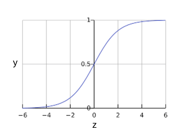
What is (Supervised) Machine Learning?
ML systems learn
how to combine input
to produce useful predictions
on never-before-seen data
Terminology: Labels and Features
Label is the true thing we're predicting: y
The y variable in basic linear regression
Terminology: Labels and Features
Label is the true thing we're predicting: y
The y variable in basic linear regression
Features are input variables describing our data: xi
The {x1, x2, ... xn} variables in basic linear regression
What is (supervised) machine learning? Concisely put, it is the following:
ML systems learn how to combine input to produce useful predictions
on never-before-seen data.
Let's explore fundamental machine learning terminology.
Labels
A label is the thing we're predicting—the y variable in
simple linear regression. The label could be the future price
of wheat, the kind of animal shown in a picture, the meaning of
an audio clip, or just about anything.
Features
A feature is an input variable—the x variable in simple linear
regression. A simple machine learning project might use a single
feature, while a more sophisticated machine learning project could
use millions of features, specified as:
$$\{x_1, x_2, ... x_N\}$$
In the spam detector example, the features could include the following:
words in the email text
sender's address
time of day the email was sent
email contains the phrase "one weird trick."
Examples
An example is a particular instance of data, x. (We put
x in boldface to indicate that it is a vector.) We break examples
into two categories:
labeled examples
unlabeled examples
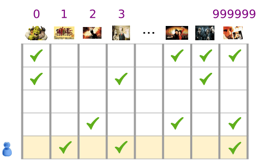
A labeled example includes both feature(s) and the label. That is:
labeled examples: {features, label}: (x, y)
Use labeled examples to train the model. In our spam detector example,
the labeled examples would be individual emails that users have explicitly
marked as "spam" or "not spam."
For example, the following table shows 5 labeled examples from a data set
containing information about housing prices in California:
housingMedianAge (feature)
totalRooms (feature)
totalBedrooms (feature)
medianHouseValue (label)
15
5612
1283
66900
19
7650
1901
80100
17
720
174
85700
14
1501
337
73400
20
1454
326
65500
An unlabeled example contains features but not the label. That is:
unlabeled examples: {features, ?}: (x, ?)
Here are 3 unlabeled examples from the same housing dataset,
which exclude medianHouseValue:
housingMedianAge (feature)
totalRooms (feature)
totalBedrooms (feature)
42
1686
361
34
1226
180
33
1077
271
Once we've trained our model with labeled examples, we use that model to
predict the label on unlabeled examples. In the spam detector, unlabeled
examples are new emails that humans haven't yet labeled.
Models
A model defines the relationship between features and label.
For example, a spam detection model might associate certain features
strongly with "spam". Let's highlight two phases of a model's life:
Training means creating or learning the model. That is,
you show the model labeled examples and enable the model to gradually
learn the relationships between features and label.
Inference means applying the trained model to unlabeled examples.
That is, you use the trained model to make useful predictions (y').
For example, during inference, you can predict medianHouseValue for
new unlabeled examples.
Regression vs. classification
A regression model predicts continuous values. For example, regression
models make predictions that answer questions like the following:
What is the value of a house in California?
What is the probability that a user will click on this ad?
A classification model predicts discrete values. For example,
classification models make predictions that answer questions like
the following:
Suppose you want to develop a supervised machine learning model to predict
whether a given email is "spam" or "not spam." Which of the
following statements are true?
Emails not marked as "spam" or "not spam" are unlabeled examples.
Because our label consists of the values "spam" and "not spam",
any email not yet marked as spam or not spam is an
unlabeled example.
Words in the subject header will make good labels.
Words in the subject header might make excellent features, but they
won't make good labels.
We'll use unlabeled examples to train the model.
We'll use labeled examples to train the model. We can then
run the trained model against unlabeled examples to infer
whether the unlabeled email messages are spam or not spam.
The labels applied to some examples might be untrustworthy.
Definitely. The labels for this dataset probably come from email
users who mark particular email messages as spam. Since very
few users mark every suspicious email message as spam, we may
have a hard time ever knowing whether an email is spam. Furthermore,
some spammers or botnets could intentionally poison our model by
providing faulty labels.
Features and Labels
Explore the options below.
Suppose an online shoe store wants to create a supervised ML model
that will provide personalized shoe recommendations to users. That is,
the model will recommend certain pairs of shoes to Marty and
different pairs of shoes to Janet. Which of the following
statements are true?
Shoe size is a useful feature.
Shoe size is a quantifiable signal that likely has
a strong impact on whether the user will like the recommended
shoes. For example, if Marty wears size 9, the model shouldn't
recommend size 7 shoes.
Shoe beauty is a useful feature.
Good features are concrete and quantifiable.
Beauty is too vague a concept to serve as a useful feature.
Beauty is probably a blend of certain concrete features,
such as style and color. Style and color would each be
better features than beauty.
User clicks on a shoe's description is a useful label.
Users probably only want to read more about those shoes that
they like. User clicks is, therefore, an observable, quantifiable
metric that could serve as a good training label.
The shoes that a user adores is a useful label.
Adoration is not an observable, quantifiable metric. The best we can
do is search for observable proxy metrics for adoration.
Linear regression is a method for finding the straight line or hyperplane
that best fits a set of points. This module explores linear regression
intuitively before laying the groundwork for a machine learning approach
to linear regression.
Learning From Data
There are lots of complex ways to learn from data
But we can start with something simple and familiar
Starting simple will open the door to some broadly useful methods
A Convenient Loss Function for Regression
L2 Loss for a given example is also called squared error
= Square of the difference between prediction and label
\(\sum \text{:We're summing over all examples in the training set.}\)
\(D \text{: Sometimes useful to average over all examples,}\)
\(\text{so divide out by} \frac{1}{\|D\|}.\)
It has long been known that crickets (an insect species) chirp more
frequently on hotter days than on cooler days. For decades, professional
and amateur scientists have cataloged data on chirps-per-minute and temperature.
As a birthday gift, your Aunt Ruth gives you her cricket database and asks you
to learn a model to predict this relationship.
Using this data, you want to explore this relationship.
First, examine your data by plotting it:
Figure 1. Chirps per Minute vs. Temperature in Celsius.
As expected, the plot shows the temperature rising with the number of chirps.
Is this relationship between chirps and temperature linear? Yes, you could
draw a single straight line like the following to approximate
this relationship:
Figure 2. A linear relationship.
True, the line doesn't pass through every dot, but the line does clearly show
the relationship between chirps and temperature. Using the equation for a
line, you could write down this relationship as follows:
$$ y = mx + b $$
where:
\(y\) is the temperature in Celsius—the value we're trying to predict.
\(m\) is the slope of the line.
\(x\) is the number of chirps per minute—the value of our input feature.
\(b\) is the y-intercept.
By convention in machine learning, you'll write the equation for a model
slightly differently:
To infer (predict) the temperature \(y'\) for a new
chirps-per-minute value \(x_1\), just substitute the \(x_1\) value into
this model.
Although this model uses only one feature, a more sophisticated model might
rely on multiple features, each having a separate weight (\(w_1\), \(w_2\), etc.).
For example, a model that relies on three features might look as follows:
Training a model simply means learning (determining) good values
for all the weights and the bias from labeled examples.
In supervised learning, a machine learning algorithm builds a model by
examining many examples and attempting to find a model that minimizes
loss; this process is called empirical risk minimization.
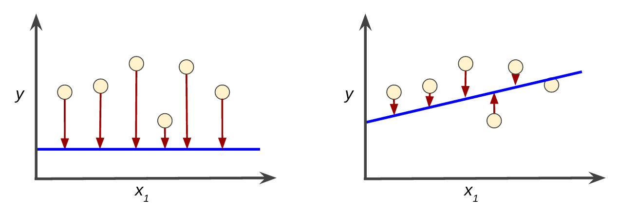
Loss is the penalty for a bad prediction. That is,
loss is a number indicating how bad the model's prediction was
on a single example. If the model's prediction is perfect,
the loss is zero; otherwise, the loss is greater. The goal of training
a model is to find a set of weights and biases that have low loss,
on average, across all examples. For example, Figure 3 shows
a high loss model on the left and a low loss model on the right.
Note the following about the figure:
The red arrow represents loss.
The blue line represents predictions.
Figure 3. High loss in the left model; low loss in the right model.
Notice that the red arrows in the left plot are much longer than
their counterparts in the right plot. Clearly, the blue line in
the right plot is a much better predictive model than the blue line
in the left plot.
You might be wondering whether you could create a mathematical function—a
loss function—that would aggregate the individual losses in a meaningful
fashion.
Squared loss: a popular loss function
The linear regression models we'll examine here use a loss function called
squared loss (also known as L2 loss).
The squared loss for a single example is as follows:
= the square of the difference between the label and the prediction
= (observation - prediction(x))2
= (y - y')2
Mean square error (MSE) is the average squared loss per example over the
whole dataset. To calculate MSE, sum up all the squared losses for individual
examples and then divide by the number of examples:
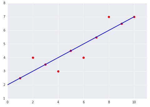
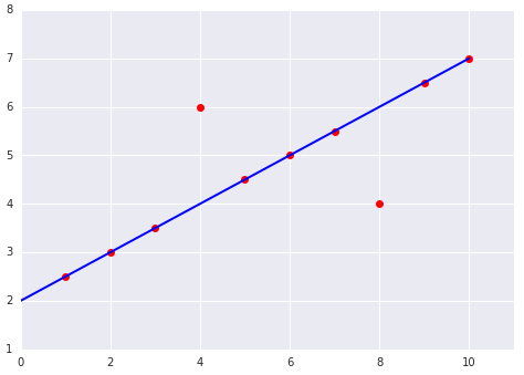
Which of the two data sets shown in the preceding plots
has the higher Mean Squared Error (MSE)?
The dataset on the left.
The six examples on the line incur a total loss of 0. The four examples
not on the line are not very far off the line, so even squaring their
offset still yields a low value:
$$ MSE = \frac{0^2 + 1^2 + 0^2 + 1^2 + 0^2 + 1^2 + 0^2 + 1^2 + 0^2 +
0^2} {10} = 0.4$$
The dataset on the right.
The eight examples on the line incur a total loss of 0. However,
although only two points lay off the line, both of those
points are twice as far off the line as the outlier points
in the left figure. Squared loss amplifies those differences,
so an offset of two incurs a loss four times greater than an offset
of one.
To train a model, we need a good way to reduce the model’s loss. An
iterative approach is one widely used method for reducing loss, and
is as easy and efficient as walking down a hill.
How do we reduce loss?
Hyperparameters are the configuration settings used to tune how the model is trained.
Derivative of (y - y')2 with respect to the weights and biases tells us how loss changes for a given example
Simple to compute and convex
So we repeatedly take small steps in the direction that minimizes loss
We call these Gradient Steps (But they're really negative Gradient Steps)
The previous module
introduced the concept of loss. Here, in this module, you'll learn how
a machine learning model iteratively reduces loss.
Iterative learning might remind you of the
"Hot and Cold"
kid's game for finding a hidden object like a thimble. In this game, the
"hidden object" is the best possible model.
You'll start with a wild guess ("The value of \(w_1\) is 0.") and
wait for the system to tell you what the loss is. Then, you'll try another
guess ("The value of \(w_1\) is 0.5.") and see what the loss is.
Aah, you're getting warmer. Actually, if you play this game right, you'll
usually be getting warmer. The real trick to the game is trying to find
the best possible model as efficiently as possible.
The following figure suggests the iterative trial-and-error process
that machine learning algorithms use to train a model:
Figure 1. An iterative approach to training a model.
We'll use this same iterative approach throughout Machine Learning Crash Course,
detailing various complications, particularly within that stormy cloud
labeled "Model (Prediction Function)."
Iterative strategies are prevalent in machine learning, primarily
because they scale so well to large data sets.
The "model" takes one or more features as input and returns one prediction
(y') as output. To simplify, consider a model that takes one feature and
returns one prediction:
$$ y' = b + w_1x_1 $$
What initial values should we set for \(b\)
and \(w_1\)? For linear regression problems, it turns
out that the starting values aren't important. We could pick
random values, but we'll just take the following trivial values instead:
\(b\) = 0
\(w_1\) = 0
Suppose that the first feature value is 10. Plugging that feature value
into the prediction function yields:
y' = 0 + 0(10)
y' = 0
The "Compute Loss" part of the diagram is the
loss function
that the model will use. Suppose
we use the squared loss function. The loss function takes
in two input values:
y': The model's prediction for features x
y: The correct label corresponding to features x.
At last, we've reached the "Compute parameter updates" part of the diagram.
It is here that the machine learning system examines the value of the loss
function and generates new values for \(b\) and \(w_1\).
For now, just assume that this mysterious box devises new values
and then the machine learning system re-evaluates all those features
against all those labels, yielding a new value for the loss function,
which yields new parameter values. And the learning continues iterating
until the algorithm discovers the model parameters with the lowest
possible loss. Usually, you iterate until overall loss stops changing
or at least changes extremely slowly. When that happens, we say that
the model has converged.
The iterative approach diagram (Figure 1)
contained a green hand-wavy box entitled "Compute parameter updates."
We'll now replace that algorithmic fairy dust with something more substantial.
Suppose we had the time and the computing resources to calculate the
loss for all possible values of \(w_1\). For the kind of
regression problems we've been examining, the resulting plot of
loss vs. \(w_1\) will always be convex. In other words, the plot
will always be bowl-shaped, kind of like this:
Figure 2. Regression problems yield convex loss vs weight plots.
Convex problems have only one minimum; that is, only one place where
the slope is exactly 0. That minimum is where the loss function
converges.
Calculating the loss function for every conceivable value of \(w_1\)
over the entire data set would be an inefficient way of finding the convergence
point. Let's examine a better mechanism—very popular in machine
learning—called gradient descent.
The first stage in gradient descent is to pick a starting value
(a starting point) for \(w_1\). The starting point doesn't
matter much; therefore, many algorithms simply set \(w_1\) to 0 or pick a
random value. The following figure shows that we've picked a starting
point slightly greater than 0:
Figure 3. A starting point for gradient descent.
The gradient descent algorithm then calculates the gradient of the
loss curve at the starting point. Here in Figure 3, the gradient of loss is
equal to the derivative
(slope) of the curve, and tells you which way is "warmer" or
"colder." When there are multiple weights, the gradient is a vector
of partial derivatives with respect to the weights.
Click the dropdown arrow to learn more about partial derivatives and gradients.
The math around machine learning is fascinating and we're delighted that
you clicked the link to learn more. Please note, however, that TensorFlow
handles all the gradient computations for you, so you don't actually
have to understand the calculus provided here.
Partial derivatives
A multivariable function is a function with more than one argument,
such as:
$$f(x,y) = e^{2y}\sin(x)$$
The partial derivative \(f\) with respect to \(x\), denoted as follows:
$$ \partial f \over \partial x $$
is the derivative of \(f\) considered as a function of \(x\)
alone. To find the following:
$$\partial f \over \partial x $$
you must hold \(y\) constant (so \(f\) is now a function of one
variable \(x\)), and take the regular derivative of \(f\)
with respect to \(x\). For example, when \(y\) is fixed at 1,
the preceding function becomes:
$$ f(x) = e^2\sin(x) $$
This is just a function of one variable \(x\), whose derivative is:
$$ e^2\cos(x) $$
In general, thinking of \(y\) as fixed, the partial derivative of \(f\) with
respect to \(x\) is calculated as follows:
Points in the direction of greatest increase of the function.
$$ {-\nabla f} $$
Points in the direction of greatest decrease of the function.
The number of dimensions in the vector is equal to the number of variables
in the formula for \(f\); in other words, the vector falls within the domain
space of the function. For instance, the graph of the following function \(f(x,y)\):
$$ f(x,y) = 4 + (x - 2)^2 + 2y^2 $$
when viewed in three dimensions with \(z = f(x,y)\) looks like a valley
with a minimum at \((2,0,4)\):
The gradient of \(f(x,y)\) is a two-dimensional vector that tells you in which
\((x,y)\) direction to move for the maximum increase in height. Thus, the
negative of the gradient moves you in the direction of maximum decrease in
height. In other words, the negative of the gradient vector points into the
valley.
In machine learning, gradients are used in gradient descent. We often have a
loss function of many variables that we are trying to minimize, and we try to do
this by following the negative of the gradient of the function.
Note that a gradient is a vector, so it has both of the following
characteristics:
a direction
a magnitude
The gradient always points in the direction of steepest increase in the
loss function. The gradient descent algorithm takes a step in the direction
of the negative gradient in order to reduce loss as quickly as possible.
Figure 4. Gradient descent relies on negative gradients.
To determine the next point along the loss function curve, the
gradient descent algorithm adds some fraction of the gradient's
magnitude to the starting point as shown in the following figure:
Figure 5. A gradient step moves us to the next point on the loss curve.
The gradient descent then repeats this process, edging ever closer
to the minimum.
As noted, the gradient vector has both a direction and a magnitude.
Gradient descent algorithms multiply the gradient by a scalar
known as the learning rate (also sometimes called step size)
to determine the next point. For example, if the gradient magnitude is
2.5 and the learning rate is 0.01, then the gradient descent algorithm
will pick the next point 0.025 away from the previous point.
Hyperparameters are the knobs that programmers tweak in machine
learning algorithms. Most machine learning programmers spend a fair
amount of time tuning the learning rate. If you pick a learning rate
that is too small, learning will take too long:
Figure 6. Learning rate is too small.
Conversely, if you specify a learning rate that is too large, the
next point will perpetually bounce haphazardly across the bottom of the well
like a quantum mechanics experiment gone horribly wrong:
Figure 7. Learning rate is too large.
There's a
Goldilocks
learning rate for every regression problem.
The Goldilocks value is related to how flat the loss function is. If you know
the gradient of the loss function is small then you can safely try a larger
learning rate, which compensates for the small gradient and results in a larger
step size.
Figure 8. Learning rate is just right.
Click the dropdown arrow to learn more about the ideal learning rate.
The ideal learning rate in one-dimension is \(\frac{ 1 }{ f(x)'' }\) (the
inverse of the second derivative of f(x) at x).
The ideal learning rate for 2 or more dimensions is
the inverse of the
Hessian (matrix of
second partial derivatives).
The story for general convex functions is more complex.
Set a learning rate of 0.1 on the slider. Keep hitting the STEP button until the gradient descent algorithm reaches the minimum point of the loss curve. How many steps did it take?
Solution
Gradient descent reaches the minimum of the curve in 81 steps.
Exercise 2
Can you reach the minimum more quickly with a higher learning rate? Set a learning rate of 1, and keep hitting STEP until gradient descent reaches the minimum. How many steps did it take this time?
Solution
Gradient descent reaches the minimum of the curve in 6 steps.
Exercise 3
How about an even larger learning rate. Reset the graph, set a learning rate of 4, and try to reach the minimum of the loss curve. What happened this time?
Solution
Gradient descent never reaches the minimum. As a result, steps progressively increase in size. Each step jumps back and forth across the bowl, climbing the curve instead of descending to the bottom.
Optional Challenge
Can you find the Goldilocks learning rate for this curve, where gradient descent reaches the minimum point in the fewest number of steps? What is the fewest number of steps required to reach the minimum?
Solution
The Goldilocks learning rate for this data is 1.6, which reaches the minimum in 1 step.
NOTE: In practice, finding a "perfect" (or near-perfect) learning rate is not essential for successful model training. The goal is to find a learning rate large enough that gradient descent converges efficiently, but not so large that it never converges.
In gradient descent, a batch is the total number of examples
you use to calculate the gradient in a single iteration.
So far, we've assumed that the batch has been the entire data set.
When working at Google scale, data sets often contain billions or
even hundreds of billions of examples. Furthermore, Google data
sets often contain huge numbers of features. Consequently, a batch
can be enormous. A very large batch may cause even a single iteration
to take a very long time to compute.
A large data set with randomly sampled examples probably contains
redundant data. In fact, redundancy becomes more likely as
the batch size grows. Some redundancy can be useful
to smooth out noisy gradients, but enormous batches tend not to
carry much more predictive value than large batches.
What if we could get the right gradient on average for much less
computation? By choosing examples at random from our data set, we
could estimate (albeit, noisily) a big average from a much smaller one.
Stochastic gradient descent (SGD) takes this idea to the
extreme--it uses only a single example (a batch size of 1) per iteration.
Given enough iterations, SGD works but is very noisy. The term
"stochastic" indicates that the one example comprising each
batch is chosen at random.
Mini-batch stochastic gradient descent (mini-batch SGD) is
a compromise between full-batch iteration and SGD. A mini-batch
is typically between 10 and 1,000 examples, chosen at random.
Mini-batch SGD reduces the amount of noise in SGD but is still
more efficient than full-batch.
To simplify the explanation, we focused on gradient descent for a single
feature. Rest assured that gradient descent also works on feature sets that
contain multiple features.
This is the first of several Playground exercises.
Playground is a program
developed especially for this course to teach machine learning principles.
Each Playground exercise generates a dataset. The label for this
dataset has two possible values. You could think of those two
possible values as spam vs. not spam or perhaps healthy trees vs. sick trees.
The goal of most exercises is to tweak various hyperparameters to build
a model that successfully classifies (separates or distinguishes) one
label value from the other. Note that most data sets contain a certain
amount of noise that will make it impossible to successfully classify
every example.
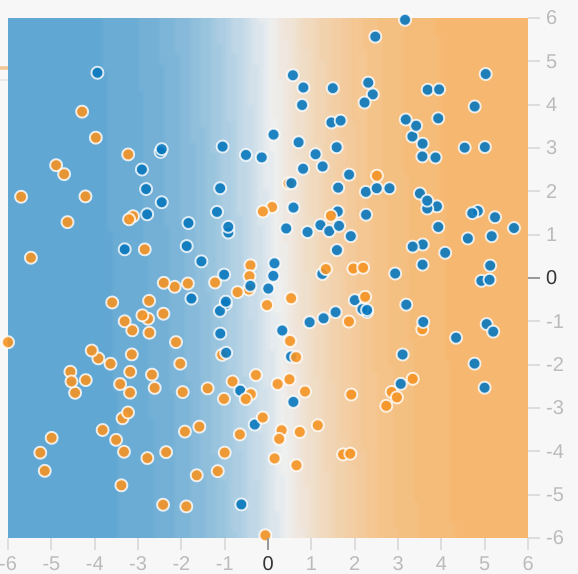
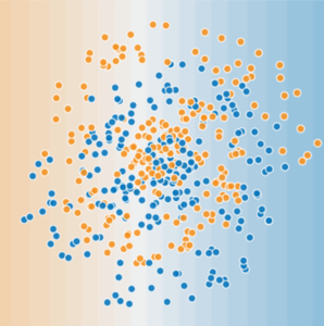
Click the dropdown arrow for an explanation of model visualization.
Each Playground exercise displays a visualization of the current
state of the model. For example, here's a visualization:
Note the following about the model visualization:
Each blue dot signifies one example of one class of data (for example,
a healthy tree).
Each orange dot signifies one example of another class of data (for
example, a diseased tree).
The background color represents the model's prediction of where examples
of that color should be found. A blue background around a blue dot
means that the model is correctly predicting that example. Conversely,
an orange background around a blue dot means that the model is
incorrectly predicting that example.
The background blues and oranges are scaled. For example, the left side of
the visualization is solid blue but gradually fades to white in the center
of the visualization. You can think of the color strength as suggesting
the model's confidence in its guess. So solid blue means that the model
is very confident about its guess and light blue means that the model
is less confident. (The model visualization shown in the figure is doing
a poor job of prediction.)
Use the visualization to judge your model's progress.
("Excellent—most of the blue dots have a blue background" or
"Oh no! The blue dots have an orange background.")
Beyond the colors, Playground
also displays the model's current loss numerically.
("Oh no! Loss is going up instead of down.")
The interface for this exercise provides three buttons:
Icon
Name
What it Does
Reset
Resets Iterations to 0. Resets any weights that model had
already learned.
Step
Advance one iteration. With each iteration, the model
changes—sometimes subtly and sometimes dramatically.
Regenerate
Generates a new data set. Does not reset Iterations.
In this first Playground exercise, you'll experiment with
learning rate by performing two tasks.
Task 1: Notice the Learning rate menu at the top-right of
Playground. The given Learning rate—3—is very high. Observe
how that high Learning rate affects your model by clicking the "Step"
button 10 or 20 times. After each early iteration, notice how the model
visualization changes dramatically. You might even see some instability
after the model appears to have converged. Also notice the lines running
from x1 and x2 to the model visualization. The weights of
these lines indicate the weights of those features in the model. That is, a
thick line indicates a high weight.
Task 2: Do the following:
Press the Reset button.
Lower the Learning rate.
Press the Step button a bunch of times.
How did the lower learning rate impact convergence? Examine both the
number of steps needed for the model to converge, and also how smoothly
and steadily the model converges. Experiment with even lower values of
learning rate. Can you find a learning rate too slow to be useful? (You'll
find a discussion just below the exercise.)
Click the dropdown arrow for a discussion about Task 2.
Due to the non-deterministic nature of Playground exercises,
we can't always provide answers that will correspond exactly with your data set.
That said, a learning rate of 0.1 converged efficiently for us.
Smaller learning rates took much longer to converge; that is, smaller
learning rates were too slow to be useful.
When performing gradient descent on a large data set, which of the
following batch sizes will likely be more efficient?
The full batch.
Computing the gradient from a full batch is inefficient. That is,
the gradient can usually be computed far more efficiently (and just
as accurately) from a smaller batch than from a vastly bigger full
batch.
A small batch or even a batch of one example (SGD).
Amazingly enough, performing gradient descent on a small batch
or even a batch of one example is usually more efficient than
the full batch. After all, finding the gradient of one example
is far cheaper than finding the gradient of millions of examples.
To ensure a good representative sample, the algorithm scoops up
another random small batch (or batch of one) on every
iteration.
import tensorflow as tf
# Set up a linear classifier.
classifier = tf.estimator.LinearClassifier(feature_columns)
# Train the model on some example data.
classifier.train(input_fn=train_input_fn, steps=2000)
# Use it to predict.
predictions = classifier.predict(input_fn=predict_input_fn)
Tensorflow is a computational framework for building machine learning models.
TensorFlow provides a variety of different toolkits that allow you to
construct models at your preferred level of abstraction. You can use lower-level
APIs to build models by defining a series of mathematical operations.
Alternatively, you can use higher-level APIs (like tf.estimator) to specify
predefined architectures, such as linear regressors or neural networks.
The following figure shows the current hierarchy of TensorFlow toolkits:
Figure 1. TensorFlow toolkit hierarchy.
The following table summarizes the purposes of the different layers:
Toolkit(s)
Description
Estimator (tf.estimator)
High-level, OOP API.
tf.layers/tf.losses/tf.metrics
Libraries for common model components.
TensorFlow
Lower-level APIs
TensorFlow consists of the following two components:
These two components are analogous to Python code and the Python interpreter.
Just as the Python interpreter is implemented on multiple hardware platforms
to run Python code, TensorFlow can run the graph on multiple hardware
platforms, including CPU, GPU, and TPU.
Which API(s) should you use? You should use the highest
level of abstraction that solves the problem.
The higher levels of abstraction are easier to use, but are also
(by design) less flexible. We recommend you start with the highest-level
API first and get everything working. If you need additional
flexibility for some special modeling concerns, move one level lower.
Note that each level is built using the APIs in lower levels, so
dropping down the hierarchy should be reasonably straightforward.
tf.estimator API
We'll use tf.estimator for the majority of exercises in Machine Learning Crash Course.
Everything you'll do in the exercises could have been done
in lower-level (raw) TensorFlow, but using tf.estimator dramatically
lowers the number of lines of code.
tf.estimator is compatible with the scikit-learn API.
Scikit-learn is an extremely popular
open-source ML library in Python, with over 100k users, including
many at Google.
Very broadly speaking, here's the pseudocode for a linear classification
program implemented in tf.estimator:
import tensorflow as tf
# Set up a linear classifier.
classifier = tf.estimator.LinearClassifier(feature_columns)
# Train the model on some example data.
classifier.train(input_fn=train_input_fn, steps=2000)
# Use it to predict.
predictions = classifier.predict(input_fn=predict_input_fn)
First Steps with TensorFlow: Programming Exercises
As you progress through Machine Learning Crash Course, you'll put the principles and techniques
you learn into practice by coding models using tf.estimator, a high-level
TensorFlow API.
The programming exercises in Machine Learning Crash Course use a data-analysis platform
that combines code, output, and descriptive text into one collaborative document.
Programming exercises run directly in your browser (no setup
required!) using the Colaboratory
platform. Colaboratory is supported on most major browsers, and is most
thoroughly tested on desktop versions of Chrome and Firefox. If you'd prefer
to download and run the exercises offline, see
these
instructions for setting up a local environment.
Run the following three exercises in the provided order:
Quick Introduction to pandas.
pandas is an important library for data analysis and modeling, and is
widely used in TensorFlow coding. This tutorial provides all the pandas information you need
for this course. If you already know pandas, you can skip this exercise.
Common hyperparameters in Machine Learning Crash Course exercises
Many of the coding exercises contain the following hyperparameters:
steps, which is the total number of training iterations. One step
calculates the loss from one batch and uses that value to modify the
model's weights once.
batch size, which is the number of examples (chosen at random) for a
single step. For example, the batch size for SGD is 1.
A convenience variable in Machine Learning Crash Course exercises
The following convenience variable appears in several exercises:
periods, which controls the granularity of reporting. For
example, if periods is set to 7 and steps is set to 70,
then the exercise will output the loss value every 10 steps (or 7 times).
Unlike hyperparameters, we don't expect you to modify the value
of periods. Note that modifying periods does not alter what
your model learns.
Generalization refers to your model's ability to adapt properly
to new, previously unseen data, drawn from the same distribution as the
one used to create the model.
The Big Picture
Goal: predict well on new data drawn from (hidden) true distribution.
Problem: we don't see the truth.
We only get to sample from it.
The Big Picture
Goal: predict well on new data drawn from (hidden) true distribution.
Problem: we don't see the truth.
We only get to sample from it.
If model h fits our current sample well, how can we trust it will predict well on other new samples?
How Do We Know If Our Model Is Good?
Theoretically:
Interesting field: generalization theory
Based on ideas of measuring model simplicity / complexity
Intuition: formalization of Occam's Razor principle
The less complex a model is, the more likely that a good empirical
result is not just due to the peculiarities of our sample
How Do We Know If Our Model Is Good?
Empirically:
Asking: will our model do well on a new sample of data?
Evaluate: get a new sample of data-call it the test set
Good performance on the test set is a useful indicator of good performance on the new data in general:
If the test set is large enough
If we don't cheat by using the test set over and over
The ML Fine Print
Three basic assumptions in all of the above:
We draw examples independently and identically (i.i.d.) at random from the distribution
The distribution is stationary: It doesn't change over time
We always pull from the same distribution: Including training, validation, and test sets
The previous module introduced the idea of dividing your data set
into two subsets:
training set—a subset to train a model.
test set—a subset to test the trained model.
You could imagine slicing the single data set as follows:
Figure 1. Slicing a single data set into a training set and test set.
Make sure that your test set meets the following two conditions:
Is large enough to yield statistically meaningful results.
Is representative of the data set as a whole. In other words, don't pick
a test set with different characteristics than the training set.
Assuming that your test set meets the preceding two conditions,
your goal is to create a model that generalizes well to new data.
Our test set serves as a proxy for new data.
For example, consider the following figure. Notice
that the model learned for the training data is very simple. This
model doesn't do a perfect job—a few predictions are wrong. However, this
model does about as well on the test data as it does on the training
data. In other words, this simple model does not overfit the training data.
Figure 2. Validating the trained model against test data.
Never train on test data. If you are seeing surprisingly good results
on your evaluation metrics, it might be a sign that you are accidentally
training on the test set. For example, high accuracy might indicate that
test data has leaked into the training set.
For example, consider a model that predicts whether an email is spam, using
the subject line, email body, and sender's email address as features.
We apportion the data into training and test sets, with an 80-20 split.
After training, the model achieves 99% precision on both the training set and
the test set. We'd expect a lower precision on the test set, so we
take another look at the data and discover that many of the examples in the test
set are duplicates of examples in the training set (we neglected to scrub
duplicate entries for the same spam email from our input database before
splitting the data). We've inadvertently trained on some of our test data,
and as a result, we're no longer accurately measuring how well our model
generalizes to new data.
We return to Playground to experiment with training sets
and test sets.
Click the dropdown arrow for a reminder of what the orange and blue dots mean.
In the visualization:
Each blue dot signifies one example of one class of data (for example,
spam).
Each orange dot signifies one example of another class of data (for
example, not spam).
The background color represents the model's prediction of where examples
of that color should be found. A blue background around a blue dot
means that the model is correctly predicting that example. Conversely,
an orange background around a blue dot means that the model is making
an incorrect prediction for that example.
This exercise provides both a test set and a training set, both drawn from
the same data set. By default, the visualization shows only the training
set. If you'd like to also see the test set, click
the Show test data checkbox just below the visualization. In the
visualization, note the following distinction:
The training examples have a white outline.
The test examples have a black outline.
Task 1: Run Playground with the given settings by doing the
following:
Click the Run/Pause button:
Watch the Test loss and Training loss values change.
When the Test loss and Training loss values stop changing
or only change once in a while, press the Run/Pause button
again to pause Playground.
Note the delta between the Test loss and Training loss. We'll try to reduce this
delta in the following tasks.
Is the delta between Test loss and Training loss lower or
higher with this new Learning rate? What happens if you modify both
Learning rate and
batch size?
Optional Task 3: A slider labeled
Ratio of training to test data lets you control the proportion of
test data to training data. For example, when set to 90%, the training set
contains many more examples than the test set. When set to 10%, the
training set contains far fewer examples than the test set.
Do the following:
Reduce the "Ratio of training data to test data" from 50% to 10%.
Experiment with Learning rate and Batch size, taking notes on your
findings.
Does altering the Ratio of training data to test data change the optimal
learning settings that you discovered in Task 2? If so, why?
Click the dropdown arrow for the answer to Task 1.
With learning rate set to 3 (the initial setting),
Test loss is significantly higher than Training loss.
Click the dropdown arrow for the answer to Task 2.
By reducing learning rate (for example, to 0.001),
Test loss drops to a value much closer to Training loss. In most runs,
increasing Batch size does not influence Training loss or Test
loss significantly. However, in a small percentage of runs, increasing
Batch size to 20 or greater causes Test loss to drop slightly
below Training loss.
Playground's data sets are randomly generated. Consequently, our
answers may not always agree exactly with yours.
Click the dropdown arrow for the answer to Task 3.
Reducing the ratio of training to test data from 50% to 10% dramatically
lowers the number of data points in the training set. With so little data,
high batch size and high learning rate cause the training model to jump
around chaotically (jumping repeatedly over the minimum point).
Before beginning this module, consider whether there are any pitfalls in using the training process
outlined in Training and Test Sets.
Explore the options below.
We looked at a process of using a test set and a training set
to drive iterations of model development. On each iteration, we'd
train on the training data and evaluate on the test data, using the
evaluation results on test data to guide choices of and changes to various
model hyperparameters like learning rate and features. Is there anything
wrong with this approach? (Pick only one answer.)
Totally fine, we're training on training data and evaluating on
separate, held-out test data.
Actually, there's a subtle issue here. Think about what might happen
if we did many, many iterations of this form.
Doing many rounds of this procedure might cause us to implicitly fit
to the peculiarities of our specific test set.
Yes indeed! The more often we evaluate on a given test set, the more we
are at risk for implicitly overfitting to that one test set.
We'll look at a better protocol next.
This is computationally inefficient. We should just pick a default set of
hyperparameters and live with them to save resources.
Although these sorts of iterations are expensive, they are a critical part
of model development. Hyperparameter settings can make an enormous difference in
model quality, and we should always budget some amount of time and computational
resources to ensure we're getting the best quality we can.
Partitioning a data set into a training set and test set lets you judge
whether a given model will generalize well to new data. However, using only
two partitions may be insufficient when doing many rounds of
hyperparameter tuning.
The previous module
introduced partitioning a data set into a training set and a test set. This partitioning
enabled you to train on one set of examples and then to test the model against a different
set of examples. With two partitions, the workflow could look as follows:
Figure 1. A possible workflow?
In the figure, "Tweak model" means adjusting anything about the model
you can dream up—from changing the learning rate, to adding or removing
features, to designing a completely new model from scratch.
At the end of this workflow, you pick the model
that does best on the test set.
Dividing the data set into two sets is a good idea, but not a panacea.
You can greatly reduce your chances of overfitting by partitioning the
data set into the three subsets shown in the following figure:
Figure 2. Slicing a single data set into three subsets.
Use the validation set to evaluate results from the training set.
Then, use the test set to double-check your evaluation
after the model has "passed" the validation set. The following figure
shows this new workflow:
Figure 3. A better workflow.
In this improved workflow:
Pick the model that does best on the validation set.
Double-check that model against the test set.
This is a better workflow because it creates fewer exposures
to the test set.
The following exercise dives more deeply into training
and evaluating a model:
Programming exercises run directly in your browser (no setup
required!) using the Colaboratory
platform. Colaboratory is supported on most major browsers, and is most
thoroughly tested on desktop versions of Chrome and Firefox. If you'd prefer
to download and run the exercises offline, see
these
instructions for setting up a local environment.
A machine learning model can't directly see, hear, or sense input examples.
Instead, you must create a representation of the data to provide the model
with a useful vantage point into the data's key qualities. That is, in order
to train a model, you must choose the set of features that best represent
the data.
From Raw Data to Features
The idea is to map each part of the vector on the left into one or more fields into the feature vector on the right.
From Raw Data to Features
From Raw Data to Features
From Raw Data to Features
Dictionary maps each street name to an int in {0, ...,V-1}
Now represent one-hot vector above as <i>
Properties of a Good Feature
Feature values should appear with non-zero value more than a small
handful of times in the dataset.
my_device_id:8SK982ZZ1242Z
device_model:galaxy_s6
Properties of a Good Feature
Features should have a clear, obvious meaning.
user_age:23
user_age:123456789
Properties of a Good Feature
Features shouldn't take on "magic" values
(use an additional boolean feature like is_watch_time_defined instead!)
watch_time: -1.0
watch_time: 1.023
watch_time_is_defined: 1.0
Properties of a Good Feature
The definition of a feature shouldn't change over time.
(Beware of depending on other ML systems!)
city_id:"br/sao_paulo"
inferred_city_cluster_id:219
Properties of a Good Feature
Distribution should not have crazy outliers
Ideally all features transformed to a similar range, like (-1, 1) or (0, 5).
The Binning Trick
The Binning Trick
Create several boolean bins, each mapping to a new unique feature
Allows model to fit a different value for each bin
Good Habits
KNOW YOUR DATA
Visualize: Plot histograms, rank most to least common.
Debug: Duplicate examples? Missing values? Outliers? Data agrees with dashboards? Training and Validation data similar?
Monitor: Feature quantiles, number of examples over time?
In traditional programming, the focus is on code. In machine learning
projects, the focus shifts to representation. That is, one way developers hone
a model is by adding and improving its features.
Mapping Raw Data to Features
The left side of Figure 1 illustrates raw data from an input data source;
the right side illustrates a feature vector, which is the set of
floating-point values comprising the examples in your data set.
Feature engineering means transforming raw data into
a feature vector. Expect to spend significant time doing feature
engineering.
Many machine learning models must represent the features as
real-numbered vectors since the feature values must be multiplied by the
model weights.
Figure 1. Feature engineering maps raw data to ML features.
Mapping numeric values
Integer and floating-point data don't need a special encoding because they can
be multiplied by a numeric weight. As suggested in Figure 2, converting the raw
integer value 6 to the feature value 6.0 is trivial:
Figure 2. Mapping integer values to floating-point values.
Mapping categorical values
Categorical
features have a discrete set of possible values.
For example, there
might be a feature called street_name with options that include:
Since models cannot multiply strings by the learned weights, we use feature
engineering to convert strings to numeric values.
We can accomplish this by defining a mapping from the feature values, which
we'll refer to as the vocabulary of possible values, to integers. Since not
every street in the world will appear in our dataset, we can group all other
streets into a catch-all "other" category, known as an OOV (out-of-vocabulary)
bucket.
Using this approach, here's how we can map our street names to numbers:
map Charleston Road to 0
map North Shoreline Boulevard to 1
map Shorebird Way to 2
map Rengstorff Avenue to 3
map everything else (OOV) to 4
However, if we incorporate these index numbers directly into our model, it will
impose some constraints that might be problematic:
We'll be learning a single weight that applies to all streets. For example, if
we learn a weight of 6 for street_name, then we will multiply it by 0 for
Charleston Road, by 1 for North Shoreline Boulevard, 2 for Shorebird Way and
so on. Consider a model that predicts house prices using street_name as a
feature. It is unlikely that there is a linear adjustment of price based
on the street name, and furthermore this would assume you have ordered the
streets based on their average house price. Our model needs the flexibility
of learning different weights for each street that will be added to the
price estimated using the other features.
We aren't accounting for cases where street_name may take multiple
values. For example, many houses are located at the corner of two streets, and
there's no way to encode that information in the street_name value if it
contains a single index.
To remove both these constraints, we can instead create a binary vector for each
categorical feature in our model that represents values as follows:
For values that apply to the example, set corresponding vector elements to 1.
Set all other elements to 0.
The length of this vector is equal to the number of elements in the vocabulary.
This representation is called a one-hot encoding when a single value is 1,
and a multi-hot encoding when multiple values are 1.
Figure 3 illustrates a one-hot encoding of a particular street: Shorebird Way.
The element in the binary vector for Shorebird Way has a value of 1, while the
elements for all other streets have values of 0.
Figure 3. Mapping street address via one-hot encoding.
This approach effectively creates a Boolean variable for every feature value
(e.g., street name). Here, if a house is on Shorebird Way then the binary value
is 1 only for Shorebird Way. Thus, the model uses only the weight for Shorebird
Way.
Similarly, if a house is at the corner of two streets, then two binary values
are set to 1, and the model uses both their respective weights.
Sparse Representation
Suppose that you had 1,000,000 different street names in your data set
that you wanted to include as values for street_name. Explicitly creating a
binary vector of 1,000,000 elements where only 1 or 2 elements are true is a
very inefficient representation in terms of both storage and computation time
when processing these vectors. In this situation, a common approach is to use a
sparse representation in which only nonzero values are stored. In sparse
representations, an independent model weight is still learned for each feature
value, as described above.
We've explored ways to map raw data into suitable feature vectors, but
that's only part of the work. We must now explore what kinds of values
actually make good features within those feature vectors.
Avoid rarely used discrete feature values
Good feature values should appear more than 5 or so times in a data set.
Doing so enables a model to learn how this feature value relates to the label.
That is, having many examples with the same discrete value gives the model a
chance to see the feature in different settings, and in turn, determine
when it's a good predictor for the label. For example, a house_type
feature would likely contain many examples in which its value was
victorian:
✔This is a good
example:house_type: victorian
Conversely, if a feature's value appears only once or very rarely, the model
can't make predictions based on that feature. For example, unique_house_id
is a bad feature because each value would be used only once, so the model
couldn't learn anything from it:
The following is an example of a unique value. This should
be avoided.✘unique_house_id: 8SK982ZZ1242Z
Prefer clear and obvious meanings
Each feature should have a clear and obvious meaning to anyone on the project.
For example, consider the following good feature for a house's age, which
is instantly recognizable as the age in years:
✔The following is a
good example of a clear value.house_age: 27
Conversely, the meaning of the following feature value is pretty much
indecipherable to anyone but the engineer who created it:
✘The following is an
example of a value that is unclear. This should be avoidedhouse_age: 851472000
In some cases, noisy data (rather than bad engineering choices) causes
unclear values. For example, the following user_age came from a source
that didn't check for appropriate values:
✘The following is an example of noisy/bad data. This should be avoided.user_age: 277
Don't mix "magic" values with actual data
Good floating-point features don't contain peculiar out-of-range
discontinuities or "magic" values. For example, suppose a feature
holds a floating-point value between 0 and 1. So, values like the
following are fine:
✔The following is a
good example:quality_rating: 0.82
quality_rating: 0.37
However, if a user didn't enter a quality_rating, perhaps the data set
represented its absence with a magic value like the following:
✘The following is an
example of a magic value. This should be avoided.quality_rating: -1
To work around magic values, convert the feature into two features:
One feature holds only quality ratings, never magic values.
One feature holds a boolean value indicating whether or not a
quality_rating was supplied. Give this boolean feature a name
like is_quality_rating_defined.
Account for upstream instability
The definition of a feature shouldn't change over time.
For example, the following value is useful because the city name
probably won't change. (Note that we'll still need to convert
a string like "br/sao_paulo" to a one-hot vector.)
✔This is a good
example:city_id: "br/sao_paulo"
But gathering a value inferred by another model carries additional costs.
Perhaps the value "219" currently represents Sao Paulo, but that representation
could easily change on a future run of the other model:
✘The following is an
example of a value that could change. This should be avoided.inferred_city_cluster: "219"
Apple trees produce some mixture of great fruit and wormy messes.
Yet the apples in high-end grocery stores display 100% perfect fruit.
Between orchard and grocery, someone spends significant time removing
the bad apples or throwing a little wax on the salvageable ones.
As an ML engineer, you'll spend enormous amounts of your time
tossing out bad examples and cleaning up the salvageable ones.
Even a few "bad apples" can spoil a large data set.
Scaling feature values
Scaling means converting floating-point feature
values from their natural range (for example, 100 to 900) into
a standard range (for example, 0 to 1 or -1 to +1).
If a feature set consists of only a single feature, then
scaling provides little to no practical benefit.
If, however, a feature set consists of multiple features,
then feature scaling provides the following benefits:
Helps gradient descent converge more quickly.
Helps avoid the "NaN trap," in which one number in the model becomes a
NaN (e.g., when a value exceeds
the floating-point precision limit during training), and—due to math
operations—every other number in the model also eventually becomes a NaN.
Helps the model learn appropriate weights for each feature.
Without feature scaling, the model will pay too much attention
to the features having a wider range.
You don't have to give every floating-point feature exactly the same
scale. Nothing terrible will happen if Feature A is scaled from -1 to +1
while Feature B is scaled from -3 to +3. However, your model will
react poorly if Feature B is scaled from 5000 to 100000.
Click the dropdown arrow to learn more about scaling.
One obvious way to scale numerical data is to linearly map
[min value, max value] to a small scale, such as [-1, +1].
Another popular scaling tactic is to calculate the Z score
of each value. The Z score relates the number of standard
deviations away from the mean. In other words:
Scaling with Z scores means that most scaled values will be
between -3 and +3, but a few values will be a little higher
or lower than that range.
Handling extreme outliers
The following plot represents a feature called roomsPerPerson
from the California Housing data set.
The value of roomsPerPerson was calculated by dividing the total number of
rooms for an area by the population for that area. The plot shows that the vast
majority of areas in California have one or two rooms per person. But take a
look along the x-axis.
Figure 4. A verrrrry lonnnnnnng tail.
How could we minimize the influence of those extreme outliers? Well, one
way would be to take the log of every value:
Figure 5. Logarithmic scaling still leaves a tail.
Log scaling does a slightly better job, but there's still a significant tail
of outlier values. Let's pick yet another approach. What if we simply "cap"
or "clip" the maximum value of roomsPerPerson at an arbitrary value, say 4.0?
Figure 6. Clipping feature values at 4.0
Clipping the feature value at 4.0 doesn't mean that we ignore all values
greater than 4.0. Rather, it means that all values that were greater
than 4.0 now become 4.0. This explains the funny hill at 4.0. Despite
that hill, the scaled feature set is now more useful
than the original data.
Binning
The following plot shows the relative prevalence of houses
at different latitudes in California. Notice the clustering—Los Angeles
is about at latitude 34 and San Francisco is roughly at latitude 38.
Figure 7. Houses per latitude.
In the data set, latitude is a floating-point value. However, it doesn't
make sense to represent latitude as a floating-point feature in our model.
That's because no linear relationship exists between latitude and housing
values. For example, houses in latitude 35 are not 35/34 more expensive (or
less expensive) than houses at latitude 34. And yet, individual latitudes
probably are a pretty good predictor of house values.
To make latitude a helpful predictor, let's divide latitudes into "bins" as
suggested by the following figure:
Figure 8. Binning values.
Instead of having one floating-point feature, we now have 11 distinct
boolean features (LatitudeBin1, LatitudeBin2, ..., LatitudeBin11).
Having 11 separate features is somewhat inelegant, so let's unite
them into a single 11-element vector. Doing so will enable us to represent
latitude 37.4 as follows:
[0, 0, 0, 0, 0, 1, 0, 0, 0, 0, 0]
Thanks to binning, our model can now learn completely different weights
for each latitude.
Click the dropdown arrow to learn more about binning boundaries.
For simplicity's sake in the latitude example, we used whole numbers as
bin boundaries. Had we wanted finer-grain resolution, we could have
split bin boundaries at, say, every tenth of a degree. Adding more
bins enables the model to learn different behaviors from latitude
37.4 than latitude 37.5, but only if there are sufficient examples at
each tenth of a latitude.
Another approach is to bin by
quantile, which
ensures that the number of examples in each bucket is equal. Binning
by quantile completely removes the need to worry about outliers.
Scrubbing
Until now, we've assumed that all the data used for training
and testing was trustworthy. In real-life, many examples in
data sets are unreliable due to one or more of the following:
Omitted values. For instance, a person forgot to enter
a value for a house's age.
Duplicate examples. For example, a server mistakenly uploaded
the same logs twice.
Bad labels. For instance, a person mislabeled a picture of
an oak tree as a maple.
Bad feature values. For example, someone typed in an extra digit,
or a thermometer was left out in the sun.
Once detected, you typically "fix" bad examples by removing them
from the data set. To detect omitted values or duplicated examples,
you can write a simple program. Detecting bad feature values or labels
can be far trickier.
In addition to detecting bad individual examples, you must also
detect bad data in the aggregate. Histograms are a great mechanism
for visualizing your data in the aggregate. In addition, getting statistics
like the following can help:
Maximum and minimum
Mean and median
Standard deviation
Consider generating lists of the most common values for discrete features.
For example, do the number of examples with country:uk match the number
you expect. Should language:jp really be the most common language in
your data set?
Know your data
Follow these rules:
Keep in mind what you think your data should look like.
Verify that the data meets these expectations (or that you can
explain why it doesn’t).
Double-check that the training data agrees with other sources
(for example, dashboards).
Treat your data with all the care that you would treat any mission-critical
code. Good ML relies on good data.
In this programming exercise, you'll create a good, minimal set of
features:
Programming exercises run directly in your browser (no setup
required!) using the Colaboratory
platform. Colaboratory is supported on most major browsers, and is most
thoroughly tested on desktop versions of Chrome and Firefox. If you'd prefer
to download and run the exercises offline, see
these
instructions for setting up a local environment.
A feature cross is a synthetic feature formed by multiplying (crossing)
two or more features. Crossing combinations of features can provide predictive
abilities beyond what those features can provide individually.
Feature Crosses
Feature crosses is the name of this approach
Define templates of the form [A x B]
Can be complex: [A x B x C x D x E]
When A and B represent boolean features, such as bins, the resulting crosses can be extremely sparse
Feature Crosses: Some Examples
Housing market price predictor:
[latitude X num_bedrooms]
Feature Crosses: Some Examples
Housing market price predictor:
[latitude X num_bedrooms]
Tic-Tac-Toe predictor:
[pos1 x pos2 x ... x pos9]
Feature Crosses: Why would we do this?
Linear learners use linear models
Such learners scale well to massive data e.g., vowpal-wabit, sofia-ml
But without feature crosses, the expressivity of these models would be limited
Using feature crosses + massive data is one efficient strategy for learning highly complex models
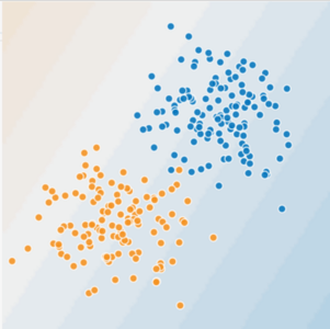
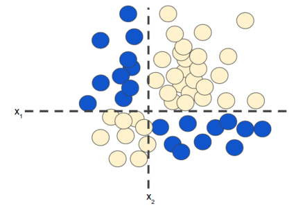
Can you draw a line that neatly separates the sick trees from the
healthy trees? Sure. This is a linear problem. The line won't be
perfect. A sick tree or two might be on the "healthy" side, but
your line will be a good predictor.
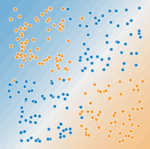
Now look at the following figure:
Figure 2. Is this a linear problem?
Can you draw a single straight line that neatly separates the sick trees
from the healthy trees? No, you can't. This is a nonlinear problem. Any line
you draw will be a poor predictor of tree health.
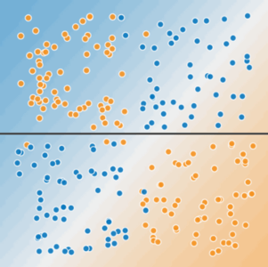
Figure 3. A single line can't separate the two classes.
To solve the nonlinear problem shown in Figure 2, create a
feature cross. A feature cross is a synthetic feature that
encodes nonlinearity in the feature space by multiplying two or
more input features together. (The term cross comes from
cross product.)
Let's create a feature cross named \(x_3\) by crossing \(x_1\)
and \(x_2\):
$$x_3 = x_1x_2$$
We treat this newly minted \(x_3\) feature cross just like any
other feature. The linear formula becomes:
$$y = b + w_1x_1 + w_2x_2 + w_3x_3$$
A linear algorithm can learn a weight for \(w_3\)
just as it would for \(w_1\) and \(w_2\).
In other words, although \(w_3\) encodes nonlinear information,
you don’t need to change how the linear model trains to determine the
value of \(w_3\).
Kinds of feature crosses
We can create many different kinds of feature crosses. For example:
[A X B]: a feature cross formed by multiplying the values of two
features.
[A x B x C x D x E]: a feature cross formed by multiplying the values
of five features.
[A x A]: a feature cross formed by squaring a single feature.
Thanks to stochastic gradient descent,
linear models can be trained efficiently. Consequently, supplementing scaled linear models with
feature crosses has traditionally been an efficient way to train on
massive-scale data sets.
So far, we've focused on feature-crossing two individual
floating-point features. In practice, machine learning models seldom
cross continuous features. However, machine learning models do
frequently cross one-hot feature vectors. Think of feature crosses of
one-hot feature vectors as logical conjunctions. For example,
suppose we have two features: country and language. A one-hot encoding
of each generates vectors with binary features that can be interpreted
as country=USA, country=France or language=English, language=Spanish.
Then, if you do a feature cross of these one-hot encodings, you get
binary features that can be interpreted as logical conjunctions, such as:
country:usa AND language:spanish
As another example, suppose you bin latitude and longitude, producing
separate one-hot five-element feature vectors. For instance, a given
latitude and longitude could be represented as follows:
Suppose you create a feature cross of these two feature vectors:
binned_latitude X binned_longitude
This feature cross is a 25-element one-hot vector (24 zeroes and 1 one).
The single 1 in the cross identifies a particular conjunction of latitude
and longitude. Your model can then learn particular associations about
that conjunction.
Suppose we bin latitude and longitude much more coarsely, as follows:
Creating a feature cross of those coarse bins leads to synthetic feature
having the following meanings:
binned_latitude_X_longitude(lat, lon) = [
0 < lat <= 10 AND 0 < lon <= 15
0 < lat <= 10 AND 15 < lon <= 30
10 < lat <= 20 AND 0 < lon <= 15
10 < lat <= 20 AND 15 < lon <= 30
20 < lat <= 30 AND 0 < lon <= 15
20 < lat <= 30 AND 15 < lon <= 30
]
Now suppose our model needs to predict how satisfied dog owners will be
with dogs based on two features:
Behavior type (barking, crying, snuggling, etc.)
Time of day
If we build a feature cross from both these features:
[behavior type X time of day]
then we'll end up with vastly more predictive ability than either feature
on its own. For example, if a dog cries (happily) at 5:00 pm when the
owner returns from work will likely be a great positive predictor of owner
satisfaction. Crying (miserably, perhaps) at 3:00 am when the owner was
sleeping soundly will likely be a strong negative predictor of owner
satisfaction.
Linear learners scale well to massive data. Using feature crosses
on massive data sets is one efficient strategy for learning highly
complex models. Neural networks
provide another strategy.
Can a feature cross truly enable a model to fit nonlinear data?
To find out, try this exercise.
Task: Try to create a model that separates the blue dots from
the orange dots by manually changing the weights of the following
three input features:
x1
x2
x1x2 (a feature cross)
To manually change a weight:
Click on a line that connects FEATURES to OUTPUT.
An input form will appear.
Type a floating-point value into that input form.
Press Enter.
Note that the interface for this exercise does not contain a Step button.
That's because this exercise does not iteratively train a model.
Rather, you will manually enter the "final" weights for the model.
(Answers appear just below the exercise.)
Click the dropdown arrow for the answer.
w1 = 0
w2 = 0
x1x2 = 1 (or any positive value)
If you enter a negative value for the feature cross, the model will separate
the blue dots from the orange dots but the predictions will be completely wrong.
That is, the model will predict orange for the blue dots, and blue for
the orange dots.
More Complex Feature Crosses
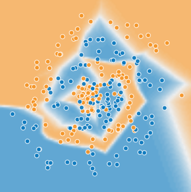
Now let's play with some advanced feature cross combinations.
The data set in this Playground
exercise looks a bit like a noisy
bullseye from a game of darts, with the blue dots in the middle and
the orange dots in an outer ring.
Click the dropdown arrow for an explanation of model visualization.
Each Playground exercise displays a visualization of the current
state of the model. For example, here's a visualization:
Note the following about the model visualization:
Each blue dot signifies one example of one class of data (for example,
a healthy tree).
Each orange dot signifies one example of another class of data (for
example, a diseased tree).
The background color represents the model's prediction of where examples
of that color should be found. A blue background around a blue dot
means that the model is correctly predicting that example. Conversely,
an orange background around a blue dot means that the model is
incorrectly predicting that example.
The background blues and oranges are scaled. For example, the left side of
the visualization is solid blue but gradually fades to white in the center
of the visualization. You can think of the color strength as suggesting
the model's confidence in its guess. So solid blue means that the model
is very confident about its guess and light blue means that the model
is less confident. (The model visualization shown in the figure is doing
a poor job of prediction.)
Use the visualization to judge your model's progress.
("Excellent—most of the blue dots have a blue background" or
"Oh no! The blue dots have an orange background.")
Beyond the colors, Playground
also displays the model's current loss numerically.
("Oh no! Loss is going up instead of down.")
Task 1: Run this linear model as given. Spend a minute or two (but no
longer) trying different learning rate settings to see if you can find
any improvements. Can a linear model produce effective results for
this data set?
Task 2: Now try adding in cross-product features, such as
x1x2, trying to optimize performance.
Which features help most?
What is the best performance that you can get?
Task 3: When you have a good model, examine the model output
surface (shown by the background color).
Does it look like a linear model?
How would you describe the model?
(Answers appear just below the exercise.)
Click the dropdown arrow for the answer to Task 1.
No. A linear model cannot effectively model this data set. Reducing
the learning rate reduces loss, but loss still converges at an
unacceptably high value.
Click the dropdown arrow for an answer to Task 2.
Playground's data sets are randomly generated. Consequently, our
answers may not always agree exactly with yours. In fact, if you
regenerate the data set between runs, your own results won't always
agree exactly with your previous runs. That said, you'll get better
results by doing the following:
Using both x12 and x22 as
feature crosses. (Adding x1x2 as a feature cross
doesn't appear to help.)
Reducing the Learning rate, perhaps to 0.001.
Click the dropdown arrow for an answer to Task 3.
The model output surface does not look like a linear model. Rather,
it looks elliptical.
In the following exercise, you'll explore feature crosses in TensorFlow:
Programming exercises run directly in your browser (no setup
required!) using the Colaboratory
platform. Colaboratory is supported on most major browsers, and is most
thoroughly tested on desktop versions of Chrome and Firefox. If you'd prefer
to download and run the exercises offline, see
these
instructions for setting up a local environment.
Different cities in California have markedly different housing prices.
Suppose you must create a model to predict housing prices. Which of the
following sets of features or feature crosses could learn
city-specific relationships between roomsPerPerson and housing
price?
Three separate binned features: [binned latitude],
[binned longitude], [binned roomsPerPerson]
Binning is good because it enables the model to learn nonlinear
relationships within a single feature. However, a city exists in
more than one dimension, so learning city-specific relationships
requires crossing latitude and longitude.
One feature cross: [latitude X longitude X
roomsPerPerson]
In this example, crossing real-valued features is not a good idea.
Crossing the real value of, say, latitude with
roomsPerPerson enables a 10% change in one feature (say, latitude)
to be equivalent to a 10% change in the other feature (say,
roomsPerPerson).
One feature cross: [binned latitude X binned longitude X binned
roomsPerPerson]
Crossing binned latitude with binned longitude enables the
model to learn city-specific effects of roomsPerPerson.
Binning prevents a change in latitude producing the same result
as a change in longitude. Depending on the granularity of
the bins, this feature cross could learn city-specific or
neighborhood-specific or even block-specific effects.
Two feature crosses: [binned latitude X binned roomsPerPerson]
and [binned longitude X binned roomsPerPerson]
Binning is a good idea; however, a city is the conjunction of
latitude and longitude, so separate feature crosses prevent the
model from learning city-specific prices.
Regularization for Simplicity: Playground Exercise
Overcrossing?
Before you watch the video or read the documentation, please complete
this exercise that explores overuse of feature crosses.
Task 1: Run the model as is, with all of the given cross-product
features. Are there any surprises in the way the model fits the data?
What is the issue?
Task 2: Try removing various cross-product features to improve
performance (albeit only slightly). Why would removing features
improve performance?
(Answers appear just below the exercise.)
Click the dropdown arrow for an answer to Task 1.
Surprisingly, the model's decision boundary looks kind of crazy. In particular,
there's a region in the upper left that's hinting towards blue, even though
there's no visible support for that in the data.
Notice the relative thickness of the five lines running from INPUT to OUTPUT.
These lines show the relative weights of the five features.
The lines emanating from X1 and X2 are much thicker than
those coming from the feature crosses. So, the feature crosses are
contributing far less to the model than the normal (uncrossed) features.
Click the dropdown arrow for an answer to Task 2.
Removing all the feature crosses gives a saner model (there is
no longer a curved boundary suggestive of overfitting)
and makes the test loss converge.
After 1,000 iterations, test loss should be a slightly lower value
than when the feature crosses were in play (although your results
may vary a bit, depending on the data set).
The data in this exercise is basically linear data plus noise.
If we use a model that is too complicated, such as one with too many
crosses, we give it the opportunity to fit to the noise in the training data,
often at the cost of making the model perform badly on test data.
\(L\text{: Aim for low training error}\)
\(\lambda\text{: A scalar value that controls how weights are balanced}\)
\(\boldsymbol{w}\text{: Balances against complexity}\)
\(^2_2\text{: The square of the}\;L_2\;\text{normalization of w}\)
Consider the following generalization curve, which shows the loss
for both the training set and validation set against the number of
training iterations.
Figure 1. Loss on training set and validation set.
Figure 1 shows a model in which training loss gradually decreases,
but validation loss eventually goes up. In other words, this generalization curve
shows that the model is
overfitting
to the data in the training set. Channeling our inner
Ockham,
perhaps we could prevent overfitting by penalizing complex models, a principle
called regularization.
In other words, instead of simply aiming to minimize loss (empirical risk minimization):
$$\text{minimize(Loss(Data|Model))}$$
we'll now minimize loss+complexity, which is called structural
risk minimization:
Our training optimization algorithm is now a function of
two terms: the loss term, which measures how well the
model fits the data, and the regularization term,
which measures model complexity.
Machine Learning Crash Course focuses on two common (and somewhat related) ways to
think of model complexity:
Model complexity as a function of the weights of all the
features in the model.
Model complexity as a function of the total number of features
with nonzero weights. (A later module
covers this approach.)
If model complexity is a function of weights, a feature weight with a
high absolute value is more complex than a feature weight
with a low absolute value.
We can quantify complexity using the L2 regularization
formula, which defines the regularization term as the sum of the squares of all
the feature weights:
But \(w_3\) (bolded above), with a squared value of 25, contributes
nearly all the complexity. The sum of the squares of all five other weights
adds just 1.915 to the L2 regularization term.
Model developers tune the overall impact of the regularization term by
multiplying its value by a scalar known as lambda (also called the
regularization rate). That is, model developers aim to do the
following:
Performing L2 regularization has the following effect on a model
Encourages weight values toward 0 (but not exactly 0)
Encourages the mean of the weights toward 0, with a normal
(bell-shaped or Gaussian) distribution.
Increasing the lambda value strengthens the regularization effect.
For example, the histogram of weights for a high value of lambda
might look as shown in Figure 2.
Figure 2. Histogram of weights.
Lowering the value of lambda tends to yield a flatter histogram, as
shown in Figure 3.
Figure 3. Histogram of weights produced by a lower lambda value.
When choosing a lambda value, the goal is to strike the right balance between
simplicity and training-data fit:
If your lambda value is too high, your model will be simple, but you
run the risk of underfitting your data. Your model won't learn enough
about the training data to make useful predictions.
If your lambda value is too low, your model will be more complex, and you
run the risk of overfitting your data. Your model will learn too
much about the particularities of the training data, and won't be
able to generalize to new data.
The ideal value of lambda produces a model that generalizes well to
new, previously unseen data.
Unfortunately, that ideal value of lambda is data-dependent,
so you'll need to do some
tuning.
Click the dropdown arrow to learn about L2 regularization and learning rate.
There's a close connection between learning rate and lambda.
Strong L2 regularization values tend
to drive feature weights closer to 0. Lower
learning rates (with early stopping) often produce the same
effect because the steps away from 0 aren't as large.
Consequently, tweaking learning rate and lambda
simultaneously may have confounding effects.
Early stopping means ending training before the model fully
reaches convergence. In practice, we often end up with some
amount of implicit early stopping when training in an
online
(continuous) fashion. That is, some new trends just haven't had
enough data yet to converge.
As noted, the effects from changes to regularization parameters can be
confounded with the effects from changes in learning rate or number of
iterations. One useful practice (when training across a fixed batch of data)
is to give yourself a high enough number of iterations that early
stopping doesn't play into things.
Regularization for Simplicity: Playground Exercise
Examining L2 regularization
This exercise contains a small, noisy training data set.
In this kind of setting, overfitting is a real concern. Fortunately,
regularization might help.
This exercise consists of three related tasks. To simplify comparisons
across the three tasks, run each task in a separate tab.
Task 1: Run the model as given for at least 500 epochs. Note
the following:
Test loss.
The delta between Test loss and Training loss.
The learned weights of the features and the feature crosses.
(The relative thickness of each line running from FEATURES to OUTPUT
represents the learned weight for that feature or feature cross.
You can find the exact weight values by hovering over
each line.)
Task 2: (Consider doing this Task in a separate tab.) Increase the
regularization rate from 0 to 0.3. Then, run the
model for at least 500 epochs and find answers to the following questions:
How does the Test loss in Task 2 differ from the Test loss in Task
1?
How does the delta between Test loss and Training loss in Task 2
differ from that of Task 1?
How do the learned weights of each feature and feature cross differ
from Task 2 to Task 1?
What do your results say about model complexity?
Task 3: Experiment with regularization rate, trying to find the
optimum value.
(Answers appear just below the exercise.)
Click the dropdown arrow for answers.
Increasing the regularization rate from 0 to 0.3 produces the following
effects:
Test loss drops significantly.
Note: While test loss decreases, training loss actually
increases. This is expected, because you've added another
term to the loss function to penalize complexity. Ultimately, all that
matters is test loss, as that's the true measure of the model's ability to
make good predictions on new data.
The delta between Test loss and Training loss drops significantly.
The weights of the features and some of the feature crosses have lower
absolute values, which implies that model complexity drops.
Given the randomness in the data set, it is impossible to predict
which regularization rate produced the best results for you.
For us, a regularization rate of either 0.3 or 1 generally produced
the lowest Test loss.
Regularization for Simplicity: Check Your Understanding
L2 Regularization
Explore the options below.
Imagine a linear model with 100 input features:
10 are highly informative.
90 are non-informative.
Assume that all features have values between -1 and 1.
Which of the following statements are true?
L2 regularization will encourage many of the
non-informative weights to be nearly (but not exactly) 0.0.
Yes, L2 regularization encourages weights to be
near 0.0, but not exactly 0.0.
L2 regularization will encourage most of the
non-informative weights to be exactly 0.0.
L2 regularization does not tend to force weights
to exactly 0.0. L2 regularization penalizes larger
weights more than smaller weights. As a weight gets close to 0.0,
L2 "pushes" less forcefully toward 0.0.
L2 regularization may cause the model to learn a
moderate weight for some non-informative features.
Surprisingly, this can happen when a non-informative feature happens
to be correlated with the label. In this case, the model incorrectly
gives such non-informative features some of the "credit" that should
have gone to informative features.
L2 Regularization and Correlated Features
Explore the options below.
Imagine a linear model with two strongly correlated features; that is,
these two features are nearly identical copies of one another but one
feature contains a small amount of random noise. If we train this
model with L2 regularization, what will happen to the weights
for these two features?
Both features will have roughly equal, moderate weights.
L2 regularization will force the features towards
roughly equivalent weights that are approximately half of
what they would have been had only one of the two features
been in the model.
One feature will have a large weight; the other will have a
weight of almost 0.0.
L2 regularization penalizes large weights more
than small weights. So, even if one weight started to drop
faster than the other, L2 regularization would
tend to force the bigger weight to drop more quickly than
the smaller weight.
One feature will have a large weight; the other will have a
weight of exactly 0.0.
L2 regularization rarely forces
weights to exactly 0.0. By contrast, L1 regularization
(discussed later) does force weights to exactly 0.0.
Instead of predicting exactly 0 or 1, logistic regression generates a
probability—a value between 0 and 1, exclusive. For example, consider a
logistic regression model for spam detection. If the model infers a value of
0.932 on a particular email message, it implies a 93.2% probability that the
email message is spam. More precisely, it means that in the limit of infinite
training examples, the set of examples for which the model predicts 0.932 will
actually be spam 93.2% of the time and the remaining 6.8% will not.
Predicting Coin Flips?
Imagine the problem of predicting probability of Heads for bent coins
You might use features like angle of bend, coin mass, etc.
What's the simplest model you could use?
What could go wrong?
Logistic Regression
Many problems require a probability estimate as output
Enter Logistic Regression
Logistic Regression
Many problems require a probability estimate as output
Enter Logistic Regression
Handy because the probability estimates are calibrated
for example, p(house will sell) * price = expected outcome
Logistic Regression
Many problems require a probability estimate as output
Enter Logistic Regression
Handy because the probability estimates are calibrated
for example, p(house will sell) * price = expected outcome
Also useful for when we need a binary classification
spam or not spam? → p(Spam)
Logistic Regression -- Predictions
$$ y' = \frac{1}{1 + e^{-(w^Tx+b)}} $$
\(\text{Where:} \)
\(x\text{: Provides the familiar linear model}\)
\(1+e^{-(...)}\text{: Squish through a sigmoid}\)
Many problems require a probability estimate as output. Logistic
regression is an extremely efficient mechanism for calculating
probabilities. Practically speaking, you can use the returned
probability in either of the following two ways:
"As is"
Converted to a binary category.
Let's consider how we might use the probability "as is." Suppose we
create a logistic regression model to predict the probability that a
dog will bark during the middle of the night. We'll call that
probability:
p(bark | night)
If the logistic regression model predicts a p(bark | night) of 0.05,
then over a year, the dog's owners should be startled awake approximately
18 times:
In many cases, you'll map the logistic regression output into the solution
to a binary classification problem, in which the goal is to correctly
predict one of two possible labels (e.g., "spam" or "not spam"). A later
module
focuses on that.
You might be wondering how a logistic regression model can ensure
output that always falls between 0 and 1. As it happens,
a sigmoid function, defined as follows, produces output having
those same characteristics:
$$y = \frac{1}{1 + e^{-z}}$$
The sigmoid function yields the following plot:
Figure 1: Sigmoid function.
If z represents the output of the linear layer of a model trained
with logistic regression, then sigmoid(z) will yield a value (a probability)
between 0 and 1. In mathematical terms:
$$y' = \frac{1}{1 + e^{-(z)}}$$
where:
y' is the output of the logistic regression model for a particular example.
z is b + w1x1 + w2x2 + ... wNxN
The w values are the model's learned weights and bias.
The x values are the feature values for a particular example.
Note that z is also referred to as the log-odds because the inverse of the
sigmoid states that z can be defined as the log of the probability of
the "1" label (e.g., "dog barks") divided by the probability of the
"0" label (e.g., "dog doesn't bark"):
$$ z = log(\frac{y}{1-y}) $$
Here is the sigmoid function with ML labels:
Figure 2: Logistic regression output.
Click the dropdown arrow to see a sample logistic regression inference calculation.
Suppose we had a logistic regression model with three features that
learned the following bias and weights:
b = 1
w1 = 2
w2 = -1
w3 = 5
Further suppose the following feature values for a given example:
x1 = 0
x2 = 10
x3 = 2
Therefore, the log-odds:
$$b + w_1x_1 + w_2x_2 + w_3x_3$$
will be:
(1) + (2)(0) + (-1)(10) + (5)(2) = 1
Consequently, the logistic regression prediction for this particular
example will be 0.731:
Regularization
is extremely important in logistic regression modeling. Without regularization,
the asymptotic nature of logistic regression would keep driving
loss towards 0 in high dimensions. Consequently, most logistic regression
models use one of the following two strategies to dampen model complexity:
L2 regularization.
Early stopping, that is, limiting the number of training steps or
the learning rate.
(We'll discuss a third strategy—L1 regularization—in a
later module.)
Imagine that you assign a unique id to each example, and map each id to
its own feature. If you don't specify a regularization function, the
model will become completely overfit. That's because the model would try
to drive loss to zero on all examples and never get there, driving the
weights for each indicator feature to +infinity or -infinity. This can
happen in high dimensional data with feature crosses, when there’s a
huge mass of rare crosses that happen only on one example each.
Fortunately, using L2 or early stopping will prevent this problem.
This module shows how logistic regression can be used for classification tasks,
and explores how to evaluate the effectiveness of classification models.
Classification vs. Regression
Sometimes, we use logistic regression for the probability outputs -- this
is a regression in (0, 1)
Other times, we'll threshold the value for a discrete binary classification
Choice of threshold is an important choice, and can be tuned
Evaluation Metrics: Accuracy
How do we evaluate classification models?
Evaluation Metrics: Accuracy
How do we evaluate classification models?
One possible measure: Accuracy
the fraction of predictions we got right
Accuracy Can Be Misleading
In many cases, accuracy is a poor or misleading metric
Most often when different kinds of mistakes have different costs
Typical case includes class imbalance, when positives or negatives are extremely rare
True Positives and False Positives
For class-imbalanced problems, useful to separate out different kinds of errors
True Positives
We correctly called wolf!
We saved the town.
False Positives
Error: we called wolf falsely.
Everyone is mad at us.
False Negatives
There was a wolf, but we didn't spot it. It ate all our chickens.
True Negatives
No wolf, no alarm. Everyone is fine.
Out of all the possible positives, how many did the model correctly identify?
Intuition: Did it miss any wolves?
When you have finished, press play ▶ to continue
Explore the options below.
Consider a classification model that separates email into two categories:
"spam" or "not spam." If you raise the classification threshold, what will
happen to precision?
Definitely increase.
Raising the classification threshold typically increases precision;
however, precision is not guaranteed to increase monotonically
as we raise the threshold.
Probably increase.
In general, raising the classification threshold reduces false
positives, thus raising precision.
Probably decrease.
In general, raising the classification threshold reduces false
positives, thus raising precision.
Definitely decrease.
In general, raising the classification threshold reduces false
positives, thus raising precision.
A ROC Curve
Each point is the TP and FP rate at one decision threshold.
Evaluation Metrics: AUC
AUC: "Area under the ROC Curve"
Evaluation Metrics: AUC
AUC: "Area under the ROC Curve"
Interpretation:
If we pick a random positive and a random negative, what's the probability my model ranks them in the correct order?
Evaluation Metrics: AUC
AUC: "Area under the ROC Curve"
Interpretation:
If we pick a random positive and a random negative, what's the probability my model ranks them in the correct order?
Intuition: gives an aggregate measure of performance aggregated across all possible classification thresholds
Prediction Bias
Logistic Regression predictions should be unbiased.
average of predictions == average of observations
Prediction Bias
Logistic Regression predictions should be unbiased.
average of predictions == average of observations
Bias is a canary.
Zero bias alone does not mean everything in your system is perfect.
But it's a great sanity check.
Prediction Bias (continued)
If you have bias, you have a problem.
Incomplete feature set?
Buggy pipeline?
Biased training sample?
Don't fix bias with a calibration layer, fix it in the model.
Look for bias in slices of data -- this can guide improvements.
Logistic regression returns a probability. You can use the returned
probability "as is" (for example, the probability that the user
will click on this ad is 0.00023) or convert the returned probability
to a binary value (for example, this email is spam).
A logistic regression model that returns 0.9995 for
a particular email message is predicting that it is very likely to be spam. Conversely,
another email message with a prediction score of 0.0003 on that same logistic
regression model is very likely not spam.
However, what about an email message with a prediction score of 0.6? In order
to map a logistic regression value to a binary category, you must define a
classification threshold (also called the decision threshold).
A value above that threshold indicates "spam"; a value below indicates "not spam."
It is tempting to assume that the classification threshold should always be 0.5,
but thresholds are problem-dependent, and are therefore values that you must tune.
The following sections take a closer
look at metrics you can use to evaluate a classification model's predictions,
as well as the impact of changing the classification threshold
on these predictions.
Classification: True vs. False and Positive vs. Negative
In this section, we'll define the primary building blocks of the metrics
we'll use to evaluate classification models. But first, a fable:
An Aesop's Fable: The Boy Who Cried Wolf (compressed)
A shepherd boy gets bored tending the town's flock. To have some fun,
he cries out, "Wolf!" even though no wolf is in sight. The villagers
run to protect the flock, but then get really mad when they realize
the boy was playing a joke on them.
[Iterate previous paragraph N times.]
One night, the shepherd boy sees a real wolf approaching the flock
and calls out, "Wolf!" The villagers refuse to be fooled again and
stay in their houses. The hungry wolf turns the flock into lamb chops.
The town goes hungry. Panic ensues.
Let's make the following definitions:
"Wolf" is a positive class.
"No wolf" is a negative class.
We can summarize our "wolf-prediction" model using a 2x2 confusion matrix that depicts all four possible
outcomes:
True Positive (TP):
Reality: A wolf threatened.
Shepherd said: "Wolf."
Outcome: Shepherd is a hero.
False Positive (FP):
Reality: No wolf threatened.
Shepherd said: "Wolf."
Outcome: Villagers are angry at shepherd for waking them up.
False Negative (FN):
Reality: A wolf threatened.
Shepherd said: "No wolf."
Outcome: The wolf ate all the sheep.
True Negative (TN):
Reality: No wolf threatened.
Shepherd said: "No wolf."
Outcome: Everyone is fine.
A true positive is an outcome where the model correctly predicts the
positive class. Similarly, a true negative is an outcome where the model
correctly predicts the negative class.
A false positive is an outcome where the model incorrectly predicts the
positive class. And a false negative is an outcome where the model
incorrectly predicts the negative class.
In the following sections, we'll look at how to evaluate classification
models using metrics derived from these four outcomes.
Accuracy is one metric for evaluating classification models. Informally,
accuracy is the fraction of predictions our model got right. Formally,
accuracy has the following definition:
$$\text{Accuracy} = \frac{\text{Number of correct predictions}}{\text{Total number of predictions}}$$
For binary classification, accuracy can also be calculated in terms of positives and negatives
as follows:
$$\text{Accuracy} = \frac{TP+TN}{TP+TN+FP+FN}$$
Where TP = True Positives, TN = True Negatives, FP = False Positives,
and FN = False Negatives.
Let's try calculating accuracy for the following model that classified
100 tumors as malignant
(the positive class) or benign
(the negative class):
Accuracy comes out to 0.91, or 91% (91 correct predictions out of 100 total
examples). That means our tumor classifier is doing a great job
of identifying malignancies, right?
Actually, let's do a closer analysis of positives and negatives to gain
more insight into our model's performance.
Of the 100 tumor examples, 91 are benign (90 TNs and 1 FP) and
9 are malignant (1 TP and 8 FNs).
Of the 91 benign tumors, the model correctly identifies 90 as
benign. That's good. However, of the 9 malignant tumors, the
model only correctly identifies 1 as malignant—a
terrible outcome, as 8 out of 9 malignancies go undiagnosed!
While 91% accuracy may seem good at first glance,
another tumor-classifier model that always predicts benign
would achieve the exact same accuracy (91/100 correct predictions)
on our examples. In other words, our model is no better than one that
has zero predictive ability to distinguish malignant tumors
from benign tumors.
Accuracy alone doesn't tell the full story when you're working
with a class-imbalanced data set, like this one,
where there is a significant disparity between
the number of positive and negative labels.
In the next section, we'll look at two better metrics
for evaluating class-imbalanced problems: precision and recall.
Our model has a recall of 0.11—in other words, it correctly
identifies 11% of all malignant tumors.
Precision and Recall: A Tug of War
To fully evaluate the effectiveness of a model, you must examine
both precision and recall. Unfortunately, precision and recall
are often in tension. That is, improving precision typically reduces recall
and vice versa. Explore this notion by looking at the following figure, which
shows 30 predictions made by an email classification model.
Those to the right of the classification threshold are
classified as "spam", while those to the left are classified as "not spam."
Figure 1. Classifying email messages as spam or not spam.
Let's calculate precision and recall based on the results shown in Figure 1:
True Positives (TP): 8
False Positives (FP): 2
False Negatives (FN): 3
True Negatives (TN): 17
Precision measures the percentage of emails
flagged as spam that were correctly classified—that
is, the percentage of dots to the right of the
threshold line that are green in Figure 1:
Recall measures the percentage of actual spam emails that were
correctly classified—that is, the percentage of green dots
that are to the right of the threshold line in Figure 1:
Classification: Check Your Understanding (Accuracy, Precision, Recall)
Accuracy
Explore the options below.
In which of the following scenarios would a high accuracy value suggest that
the ML model is doing a good job?
A deadly, but curable, medical condition afflicts .01% of the
population. An ML model uses symptoms as features and predicts
this affliction with an accuracy of 99.99%.
Accuracy is a poor metric here. After all, even a "dumb" model
that always predicts "not sick" would still be 99.99% accurate.
Mistakenly predicting "not sick" for a person who actually is sick
could be deadly.
An expensive robotic chicken crosses a very busy road a
thousand times per day. An ML model evaluates traffic patterns and
predicts when this chicken can safely cross the street with an
accuracy of 99.99%.
A 99.99% accuracy value on a very busy road strongly suggests that
the ML model is far better than chance. In some settings, however,
the cost of making even a small number of mistakes is still too high.
99.99% accuracy means that the expensive chicken will need to be
replaced, on average, every 10 days. (The chicken might also cause
extensive damage to cars that it hits.)
In the game of
roulette, a ball
is dropped on a spinning wheel and eventually lands in one of 38
slots. Using visual features (the spin of the ball, the position of
the wheel when the ball was dropped, the height of the ball over the
wheel), an ML model can predict the slot that the ball will land in
with an accuracy of 4%.
This ML model is making predictions far better than chance; a random
guess would be correct 1/38 of the time—yielding an accuracy of 2.6%.
Although the model's accuracy is "only" 4%, the benefits of success
far outweigh the disadvantages of failure.
Precision
Explore the options below.
Consider a classification model that separates email into two categories:
"spam" or "not spam." If you raise the classification threshold, what will
happen to precision?
Definitely increase.
Raising the classification threshold typically increases precision;
however, precision is not guaranteed to increase monotonically
as we raise the threshold.
Probably increase.
In general, raising the classification threshold reduces false
positives, thus raising precision.
Probably decrease.
In general, raising the classification threshold reduces false
positives, thus raising precision.
Definitely decrease.
In general, raising the classification threshold reduces false
positives, thus raising precision.
Recall
Explore the options below.
Consider a classification model that separates email into two categories:
"spam" or "not spam." If you raise the classification threshold, what will
happen to recall?
Always increase.
Raising the classification threshold will cause both of the following:
The number of true positives will decrease or
stay the same.
The number of false negatives will increase or
stay the same.
Thus, recall will never increase.
Always decrease or stay the same.
Raising our classification threshold will cause the number of
true positives to decrease or stay the same and will cause the
number of false negatives to increase or stay the same. Thus,
recall will either stay constant or decrease.
Always stay constant.
Raising our classification threshold will cause the number of
true positives to decrease or stay the same and will cause the
number of false negatives to increase or stay the same. Thus,
recall will either stay constant or decrease.
Precision and Recall
Explore the options below.
Consider two models—A and B—that each evaluate the same dataset.
Which one of the following statements is true?
If Model A has better precision than model B, then
model A is better.
While better precision is good, it might be coming at the expense
of a large reduction in recall. In general, we need to look at
both precision and recall together, or summary metrics like AUC
which we'll talk about next.
If model A has better recall than model B, then model A is
better.
While better recall is good, it might be coming at the
expense of a large reduction in precision. In general, we need
to look at both precision and recall together, or summary metrics
like AUC, which we'll talk about next.
If model A has better precision and better recall than model B,
then model A is probably better.
In general, a model that outperforms another model on both
precision and recall is likely the better model. Obviously,
we'll need to make sure that comparison is being done at a
precision / recall point that is useful in practice for this
to be meaningful. For example, suppose our spam detection model
needs to have at least 90% precision to be useful and avoid
unnecessary false alarms. In this case, comparing
one model at {20% precision, 99% recall} to another at
{15% precision, 98% recall} is not particularly instructive, as
neither model meets the 90% precision requirement. But with that caveat
in mind, this is a good way to think about comparing models when using
precision and recall.
An ROC curve (receiver operating characteristic curve) is a graph
showing the performance of a classification model at all classification
thresholds. This curve plots two parameters:
True Positive Rate
False Positive Rate
True Positive Rate (TPR) is a synonym for recall and is therefore
defined as follows:
$$TPR = \frac{TP} {TP + FN}$$
False Positive Rate (FPR) is defined as follows:
$$FPR = \frac{FP} {FP + TN}$$
An ROC curve plots TPR vs. FPR at different classification thresholds.
Lowering the classification threshold classifies more items as positive, thus
increasing both False Positives and True Positives. The following figure shows a
typical ROC curve.
Figure 4. TP vs. FP rate at different classification thresholds.
To compute the points in an ROC curve, we could evaluate a logistic regression
model many times with different classification thresholds, but this would be
inefficient. Fortunately, there's an efficient, sorting-based algorithm
that can provide this information for us, called AUC.
AUC: Area Under the ROC Curve
AUC stands for "Area under the ROC Curve." That is, AUC measures the
entire two-dimensional area underneath the
entire ROC curve (think integral calculus) from (0,0) to (1,1).
Figure 5. AUC (Area under the ROC Curve).
AUC provides an aggregate measure of performance across all possible
classification thresholds. One way of interpreting AUC is as the probability
that the model ranks a random positive example more highly than a random
negative example. For example, given the following examples, which are arranged
from left to right in ascending order of logistic regression predictions:
Figure 6. Predictions ranked in ascending order of logistic regression score.
AUC represents the probability that a random positive (green) example is positioned
to the right of a random negative (red) example.
AUC ranges in value from 0 to 1. A model whose predictions are 100% wrong
has an AUC of 0.0; one whose predictions are 100% correct has an AUC of 1.0.
AUC is desirable for the following two reasons:
AUC is scale-invariant. It measures how well predictions
are ranked, rather than their absolute values.
AUC is classification-threshold-invariant. It measures the
quality of the model's predictions irrespective of what
classification threshold is chosen.
However, both these reasons come with caveats, which may
limit the usefulness of AUC in certain use cases:
Scale invariance is not always desirable. For example, sometimes we
really do need well calibrated probability outputs, and AUC won’t tell
us about that.
Classification-threshold invariance is not always desirable. In cases
where there are wide disparities in the cost of false negatives
vs. false positives, it may be critical to minimize one type of
classification error. For example, when doing email spam detection,
you likely want to prioritize minimizing false positives (even if
that results in a significant increase of false negatives). AUC
isn't a useful metric for this type of optimization.
Classification: Check Your Understanding (ROC and AUC)
ROC and AUC
Explore the options below.
Which of the following ROC curves produce AUC values greater than 0.5?
This is the best possible ROC curve, as it ranks all positives
above all negatives. It has an AUC of 1.0.
In practice, if you have a "perfect" classifier with an AUC of 1.0,
you should be suspicious, as it likely indicates a bug in your model. For example,
you may have overfit to your training data, or the label data may be replicated
in one of your features.
This is the worst possible ROC curve; it ranks all negatives above all positives, and has
an AUC of 0.0. If you were to reverse every prediction (flip negatives to positives and
postives to negatives), you'd actually have a perfect classifier!
This ROC curve has an AUC of 0.5, meaning it ranks a random positive example
higher than a random negative example 50% of the time. As such, the
corresponding classification model is basically worthless, as its predictive
ability is no better than random guessing.
This ROC curve has an AUC between 0.5 and 1.0, meaning it ranks a random positive
example higher than a random negative example more than 50% of the time. Real-world
binary classification AUC values generally fall into this range.
This ROC curve has an AUC between 0 and 0.5, meaning it ranks a random positive
example higher than a random negative example less than 50% of the time.
The corresponding model actually performs worse than random guessing! If you
see an ROC curve like this, it likely indicates there's a bug in your data.
AUC and Scaling Predictions
Explore the options below.
How would multiplying all of the predictions from a given model by 2.0 (for
example, if the model predicts 0.4, we multiply by 2.0 to get a prediction
of 0.8) change the model's performance as measured by AUC?
No change. AUC only cares about relative prediction scores.
Yes, AUC is based on the relative predictions, so any transformation of
the predictions that preserves the relative ranking has no effect on AUC.
This is clearly not the case for other metrics such as squared error,
log loss, or prediction bias (discussed later).
It would make AUC terrible, since the prediction values are now way off.
Interestingly enough, even though the prediction values are different (and
likely farther from the truth), multiplying them all by 2.0 would keep the relative
ordering of prediction values the same. Since AUC only cares about relative rankings,
it is not impacted by any simple scaling of the predictions.
It would make AUC better, because the prediction values are all farther apart.
The amount of spread between predictions does not actually impact AUC. Even a
prediction score for a randomly drawn true positive is only a tiny epsilon greater than a randomly
drawn negative, that will count that as a success contributing to the overall
AUC score.
Logistic regression predictions should be unbiased. That is:
"average of predictions" should ≈ "average of observations"
Prediction bias is a quantity that measures how far apart
those two averages are. That is:
$$\text{prediction bias} = \text{average of predictions} - \text{average of labels in data set}$$
A significant nonzero prediction bias tells you there is a bug somewhere in
your model, as it indicates that the model is wrong about how frequently
positive labels occur.
For example, let's say we know that on average, 1% of all emails are spam.
If we don't know anything at all about a given email, we should predict that it's
1% likely to be spam. Similarly, a good spam model should predict on average that
emails are 1% likely to be spam. (In other words, if we average the predicted likelihoods
of each individual email being spam, the result should be 1%.) If instead, the model's
average prediction is 20% likelihood of being spam, we can conclude that it exhibits prediction bias.
Possible root causes of prediction bias are:
Incomplete feature set
Noisy data set
Buggy pipeline
Biased training sample
Overly strong regularization
You might be tempted to correct prediction bias by post-processing
the learned model—that is, by adding a calibration layer that
adjusts your model's output to reduce the prediction bias.
For example, if your model has +3% bias, you could add a calibration layer
that lowers the mean prediction by 3%. However, adding a calibration layer
is a bad idea for the following reasons:
You're fixing the symptom rather than the cause.
You've built a more brittle system that you must now keep
up to date.
If possible, avoid calibration layers. Projects that use calibration
layers tend to become reliant on them—using calibration layers to fix
all their model's sins. Ultimately, maintaining the calibration layers
can become a nightmare.
Bucketing and Prediction Bias
Logistic regression predicts a value between 0 and 1. However,
all labeled examples are either exactly 0 (meaning, for example, "not spam") or
exactly 1 (meaning, for example, "spam"). Therefore, when
examining prediction bias, you cannot accurately determine the prediction bias
based on only one example; you must examine the prediction bias on a "bucket"
of examples. That is, prediction bias for logistic regression only makes
sense when grouping enough examples together to be able to compare a
predicted value (for example, 0.392) to observed values (for example, 0.394).
You can form buckets in the following ways:
Linearly breaking up the target predictions.
Forming quantiles.
Consider the following calibration plot from a particular model. Each
dot represents a bucket of 1,000 values. The axes have the following
meanings:
The x-axis represents the average of values the model predicted for
that bucket.
The y-axis represents the actual average of values in the data set
for that bucket.
In the following exercise, you'll explore logistic regression and
classification in TensorFlow:
Programming exercises run directly in your browser (no setup
required!) using the Colaboratory
platform. Colaboratory is supported on most major browsers, and is most
thoroughly tested on desktop versions of Chrome and Firefox. If you'd prefer
to download and run the exercises offline, see
these
instructions for setting up a local environment.
Sparse vectors often contain many dimensions. Creating a
feature cross
results in even more dimensions. Given such high-dimensional feature vectors,
model size may become huge and require huge amounts of RAM.
In a high-dimensional sparse vector, it would be nice to
encourage weights to drop to exactly 0 where possible. A weight of
exactly 0 essentially removes the corresponding feature from the model.
Zeroing out features will save RAM and may reduce noise in the model.
For example, consider a housing data set that covers not just
California but the entire globe. Bucketing global latitude
at the minute level (60 minutes per degree)
gives about 10,000 dimensions in a sparse encoding; global longitude at the
minute level gives about 20,000 dimensions. A feature cross of these two
features would result in roughly 200,000,000 dimensions. Many of those
200,000,000 dimensions represent areas of such limited residence (for
example, the middle of the ocean) that it would be difficult
to use that data to generalize effectively.
It would be silly to pay the RAM cost of storing these unneeded dimensions.
Therefore, it would be nice to encourage the weights for the meaningless
dimensions to drop to exactly 0, which would allow us to avoid paying
for the storage cost of these model coefficients at inference time.
We might be able to encode this idea into the optimization problem done
at training time, by adding an appropriately chosen regularization term.
Would L2 regularization accomplish this task? Unfortunately not.
L2 regularization encourages weights to be small,
but doesn't force them to exactly 0.0.
An alternative idea would be to try
and create a regularization term that penalizes the count of non-zero
coefficient values in a model. Increasing this count would only be justified
if there was a sufficient gain in the model's ability to fit the data.
Unfortunately, while this count-based approach is intuitively appealing, it
would turn our convex optimization problem into a non-convex optimization
problem that's NP-hard.
(If you squint, you can see a connection to the knapsack problem.)
So this idea, known as L0 regularization isn't
something we can use effectively in practice.
However, there is a regularization term called L1
regularization that serves as an approximation to L0, but has
the advantage of being convex and thus efficient to compute. So we can
use L1 regularization to encourage many of the uninformative
coefficients in our model to be exactly 0, and thus reap RAM savings at
inference time.
L1 vs L2 regularization.
L2 and L1 penalize weights differently:
L2 penalizes weight2.
L1 penalizes |weight|.
Consequently, L2 and L1 have different derivatives:
The derivative of L2 is 2 * weight.
The derivative of L1 is k (a constant, whose
value is independent of weight).
You can think of the derivative of L2 as a force that removes x% of
the weight every time. As
Zeno
knew, even if you remove x percent of a number billions of times, the
diminished number will still never quite reach zero. (Zeno was less familiar
with floating-point precision limitations, which could possibly produce
exactly zero.) At any rate, L2 does not normally drive
weights to zero.
You can think of the derivative of L1 as a force that subtracts
some constant from the weight every time. However, thanks to absolute values,
L1 has a discontinuity at 0, which causes subtraction results
that cross 0 to become zeroed out. For example, if subtraction would have
forced a weight from +0.1 to -0.2, L1 will set the weight to
exactly 0. Eureka, L1 zeroed out the weight.
L1 regularization—penalizing the absolute value of all the
weights—turns out to be quite efficient for wide models.
Note that this description is true for a one-dimensional model.
Click the Play button
(play_arrow)
below to compare the effect L1 and L2 regularization have
on a network of weights.
This exercise contains a small, slightly noisy, training
data set. In this kind of setting, overfitting is a real concern.
Regularization might help, but which form of regularization?
This exercise consists of five related tasks. To simplify comparisons
across the five tasks, run each task in a separate tab.
Notice that the thicknesses of the lines connecting FEATURES and OUTPUT
represent the relative weights of each feature.
Task
Regularization Type
Regularization Rate (lambda)
1
L2
0.1
2
L2
0.3
3
L1
0.1
4
L1
0.3
5
L1
experiment
Questions:
How does switching from L2 to L1 regularization
influence the delta between test loss and training loss?
How does switching from L2 to L1 regularization
influence the learned weights?
How does increasing the L1 regularization rate (lambda) influence
the learned weights?
(Answers appear just below the exercise.)
Click the dropdown arrow for answers.
Switching from L2 to L1 regularization dramatically
reduces the delta between test loss and training loss.
Switching from L2 to L1 regularization dampens
all of the learned weights.
Increasing the L1 regularization rate generally dampens
the learned weights; however, if the regularization rate goes too high,
the model can't converge and losses are very high.
In the following exercise, you'll explore L1 regularization
in TensorFlow:
Programming exercises run directly in your browser (no setup
required!) using the Colaboratory
platform. Colaboratory is supported on most major browsers, and is most
thoroughly tested on desktop versions of Chrome and Firefox. If you'd prefer
to download and run the exercises offline, see
these
instructions for setting up a local environment.
Regularization for Sparsity: Check Your Understanding
L1 regularization
Explore the options below.
Imagine a linear model with 100 input features:
10 are highly informative.
90 are non-informative.
Assume that all features have values between -1 and 1.
Which of the following statements are true?
L1 regularization will encourage many of the non-informative weights
to be nearly (but not exactly) 0.0.
In general, L1 regularization of sufficient lambda tends
to encourage non-informative features to weights of exactly 0.0.
Unlike L2 regularization, L1 regularization "pushes" just as hard
toward 0.0 no matter how far the weight is from 0.0.
L1 regularization will encourage most of the non-informative weights
to be exactly 0.0.
L1 regularization of sufficient lambda tends to encourage
non-informative weights to become exactly 0.0. By doing so, these
non-informative features leave the model.
L1 regularization may cause informative features to get a
weight of exactly 0.0.
Be careful--L1 regularization may cause the following kinds of
features to be given weights of exactly 0:
Weakly informative features.
Strongly informative features on different scales.
Informative features strongly correlated with other
similarly informative features.
L1 vs. L2 Regularization
Explore the options below.
Imagine a linear model with 100 input features, all having values
between -1 and 1:
10 are highly informative.
90 are non-informative.
Which type of regularization will produce the smaller model?
L2 regularization.
L2 regularization rarely reduces the number of features.
In other words, L2 regularization rarely reduces the
model size.
L1 regularization.
L1 regularization tends to reduce the number of
features. In other words, L1 regularization often
reduces the model size.
If you recall from the Feature Crosses unit,
the following classification problem is nonlinear:
Figure 1. Nonlinear classification problem.
"Nonlinear" means that you can't accurately predict a label with a
model of the form $$b + w_1x_1 + w_2x_2$$ In other words, the
"decision surface" is not a line. Previously, we looked at
feature crosses
as one possible approach to modeling nonlinear problems.
Now consider the following data set:
Figure 2. A more difficult nonlinear classification problem.
The data set shown in Figure 2 can't be solved with a linear model.
To see how neural networks might help with nonlinear problems, let's start
by representing a linear model as a graph:
Figure 3. Linear model as graph.
Each blue circle represents an input feature, and the green circle represents
the weighted sum of the inputs.
How can we alter this model to improve its ability to deal with nonlinear
problems?
Hidden Layers
In the model represented by the following graph, we've added a "hidden layer"
of intermediary values. Each yellow node in the hidden layer is a weighted sum
of the blue input node values. The output is a weighted sum of the yellow
nodes.
Figure 4. Graph of two-layer model.
Is this model linear? Yes—its output is still a linear combination of
its inputs.
In the model represented by the following graph, we've added a second hidden
layer of weighted sums.
Figure 5. Graph of three-layer model.
Is this model still linear? Yes, it is. When you express the output as a
function of the input and simplify, you get just another weighted sum of
the inputs. This sum won't effectively model the nonlinear problem in Figure 2.
Activation Functions
To model a nonlinear problem, we can directly introduce a nonlinearity. We can
pipe each hidden layer node through a nonlinear function.
In the model represented by the following graph, the value of each node in
Hidden Layer 1 is transformed by a nonlinear function before being passed on
to the weighted sums of the next layer. This nonlinear function is called the
activation function.
Figure 6. Graph of three-layer model with activation function.
Now that we've added an activation function, adding layers has more impact.
Stacking nonlinearities on nonlinearities lets us model very complicated
relationships between the inputs and the predicted outputs. In brief, each
layer is effectively learning a more complex, higher-level function over the
raw inputs. If you'd like to develop more intuition on how this works, see
Chris Olah's excellent blog post.
Common Activation Functions
The following sigmoid activation function converts the weighted sum to
a value between 0 and 1.
$$F(x)=\frac{1} {1+e^{-x}}$$
Here's a plot:
Figure 7. Sigmoid activation function.
The following rectified linear unit activation function (or ReLU, for
short) often works a little better than a smooth function like the sigmoid,
while also being significantly easier to compute.
$$F(x)=max(0,x)$$
The superiority of ReLU is based on empirical findings, probably driven by ReLU
having a more useful range of responsiveness. A sigmoid's responsiveness falls
off relatively quickly on both sides.
Figure 8. ReLU activation function.
In fact, any mathematical function can serve as an activation function.
Suppose that \(\sigma\) represents our activation function
(Relu, Sigmoid, or whatever).
Consequently, the value of a node in the network is given by the following
formula:
Now our model has all the standard components of what people usually
mean when they say "neural network":
A set of nodes, analogous to neurons, organized in layers.
A set of weights representing the connections between each neural network
layer and the layer beneath it. The layer beneath may be
another neural network layer, or some other kind of layer.
A set of biases, one for each node.
An activation function that transforms the output of each node in a layer.
Different layers may have different activation functions.
A caveat: neural networks aren't necessarily always better than
feature crosses, but neural networks do offer a flexible alternative that works
well in many cases.
Introduction to Neural Networks: Playground Exercises
A First Neural Network
In this exercise, we will train our first little neural net.
Neural nets will give us a way to learn nonlinear models without
the use of explicit feature crosses.
Task 1: The model as given combines our two input features into
a single neuron. Will this model learn any nonlinearities?
Run it to confirm your guess.
Task 2: Try increasing the number of neurons in the hidden layer
from 1 to 2, and also try changing from a Linear activation to a
nonlinear activation like ReLU. Can you create a model that can
learn nonlinearities?
Task 3: Continue experimenting by adding or removing hidden layers
and neurons per layer. Also feel free to change learning rates,
regularization, and other learning settings. What is the smallest
number of nodes and layers you can use that gives test loss
of 0.177 or lower?
(Answers appear just below the exercise.)
Click the dropdown arrow for an answer to Task 1.
The Activation is set to Linear, so this model cannot learn
any nonlinearities. The loss is very high.
Click the dropdown arrow for an answer to Task 2.
The nonlinear Activation function can learn nonlinear models. However,
a single hidden layer with 2 neurons will take a while to learn the model.
These exercises are nondeterministic, so some runs will not learn an
effective model, while other runs will do a pretty good job.
Click the dropdown arrow for an answer to Task 3.
Playground's nondeterministic nature shines through on this exercise.
Some runs produce very low test loss with 3 Hidden Layers, arranged
as follows:
First layer had 3 neurons.
Second layer had 3 neurons.
Third layer had 2 neurons.
However, other runs with the same configuration yielded very high loss.
Neural Net Initialization
This exercise uses the XOR data again, but looks at the repeatability
of training Neural Nets and the importance of initialization.
Task 1: Run the model as given four or five times. Before each trial,
hit the Reset the network button to get a new random initialization.
(The Reset the network button is the circular reset arrow just to the
left of the Play button.) Let each trial run for at least 500 steps
to ensure convergence. What shape does each model output converge to?
What does this say about the role of initialization in non-convex
optimization?
Task 2: Try making the model slightly more complex by adding a layer
and a couple of extra nodes. Repeat the trials from Task 1. Does this
add any additional stability to the results?
(Answers appear just below the exercise.)
Click the dropdown arrow for an answer to Task 1.
The learned model had different shapes on each run. The converged
test loss varied almost 2X from lowest to highest.
Click the dropdown arrow for an answer to Task 2.
Adding the layer and extra nodes produced more repeatable results.
On each run, the resulting model looked roughly the same. Furthermore,
the converged test loss showed less variance between runs.
Neural Net Spiral
This data set is a noisy spiral. Obviously, a linear model will fail here,
but even manually defined feature crosses may be hard to construct.
Task 1: Train the best model you can, using just X1 and
X2. Feel free to add or remove layers and neurons, change
learning settings like learning rate, regularization rate, and
batch size. What is the best test loss you can get? How smooth is
the model output surface?
Task 2: Even with Neural Nets, some amount of feature engineering is
often needed to achieve best performance. Try adding in additional
cross product features or other transformations like
sin(X1) and sin(X2). Do you get a better
model? Is the model output surface any smoother?
(Answers appear just below the exercise.)
Click the dropdown arrow for possible answers.
The following video walks through how to choose hyperparameters in Playground
to train a model for the spiral data that minimizes test loss.
Introduction to Neural Networks: Programming Exercise
The following exercise demonstrates how to use neural nets to
learn nonlinearities:
Programming exercises run directly in your browser (no setup
required!) using the Colaboratory
platform. Colaboratory is supported on most major browsers, and is most
thoroughly tested on desktop versions of Chrome and Firefox. If you'd prefer
to download and run the exercises offline, see
these
instructions for setting up a local environment.
Backpropagation is the most common training algorithm for neural networks.
It makes gradient descent feasible for multi-layer neural networks.
TensorFlow handles backpropagation automatically, so you don't need a deep
understanding of the algorithm. To get a sense of how it works, walk through
the following:
Backpropagation algorithm visual explanation.
As you scroll through the preceding explanation, note the following:
How data flows through the graph.
How dynamic programming lets us avoid computing exponentially many
paths through the graph. Here "dynamic programming" just means recording
intermediate results on the forward and backward passes.
Backprop: What You Need To Know
Gradients are important
If it's differentiable, we can probably learn on it
Backprop: What You Need To Know
Gradients are important
If it's differentiable, we can probably learn on it
Gradients can vanish
Each additional layer can successively reduce signal vs. noise
ReLus are useful here
Backprop: What You Need To Know
Gradients are important
If it's differentiable, we can probably learn on it
Gradients can vanish
Each additional layer can successively reduce signal vs. noise
ReLus are useful here
Gradients can explode
Learning rates are important here
Batch normalization (useful knob) can help
ReLu layers can die
Keep calm and lower your learning rates
Normalizing Feature Values
We'd like our features to have reasonable scales
Roughly zero-centered, [-1, 1] range often works well
Helps gradient descent converge; avoid NaN trap
Avoiding outlier values can also help
Can use a few standard methods:
Linear scaling
Hard cap (clipping) to max, min
Log scaling
Dropout Regularization
Dropout: Another form of regularization, useful for NNs
Works by randomly "dropping out" units in a network for a single gradient step
There's a connection to ensemble models here
The more you drop out, the stronger the regularization
This section explains backpropagation's failure cases and the most
common way to regularize a neural network.
Failure Cases
There are a number of common ways for backpropagation to go wrong.
Vanishing Gradients
The gradients for the lower layers (closer to the input) can become very
small. In deep networks, computing these gradients can involve taking the
product of many small terms.
When the gradients vanish toward 0 for the lower layers, these layers train
very slowly, or not at all.
The ReLU activation function can help prevent vanishing gradients.
Exploding Gradients
If the weights in a network are very large, then the gradients for the lower
layers involve products of many large terms. In this case you can have
exploding gradients: gradients that get too large to converge.
Batch normalization can help prevent exploding gradients, as can lowering the
learning rate.
Dead ReLU Units
Once the weighted sum for a ReLU unit falls below 0, the ReLU unit can get
stuck. It outputs 0 activation, contributing nothing to the network's output,
and gradients can no longer flow through it during backpropagation. With a
source of gradients cut off, the input to the ReLU may not ever change enough
to bring the weighted sum back above 0.
Lowering the learning rate can help keep ReLU units from dying.
Dropout Regularization
Yet another form of regularization, called Dropout, is useful for
neural networks. It works by randomly "dropping out" unit activations in a
network for a single gradient step. The more you drop out, the
stronger the regularization:
0.0 = No dropout regularization.
1.0 = Drop out everything. The model learns nothing.
The following exercise focuses on improving the performance
of the neural net you trained in the previous exercise:
Programming exercises run directly in your browser (no setup
required!) using the Colaboratory
platform. Colaboratory is supported on most major browsers, and is most
thoroughly tested on desktop versions of Chrome and Firefox. If you'd prefer
to download and run the exercises offline, see
these
instructions for setting up a local environment.
Earlier, you encountered binary classification models
that could pick between one of two possible choices, such as whether:
A given email is spam or not spam.
A given tumor is malignant or benign.
In this module, we'll investigate multi-class classification, which
can pick from multiple possibilities. For example:
Is this dog a beagle, a basset hound, or a bloodhound?
Is this flower a Siberian Iris, Dutch Iris, Blue Flag Iris,
or Dwarf Bearded Iris?
Is that plane a Boeing 747, Airbus 320, Boeing 777, or Embraer 190?
Is this an image of an apple, bear, candy, dog, or egg?
Some real-world multi-class problems entail choosing from millions
of separate classes. For example, consider a multi-class classification
model that can identify the image of just about anything.
More than two classes?
Logistic regression gives useful probabilities for binary-class problems.
spam / not-spam
click / not-click
What about multi-class problems?
apple, banana, car, cardiologist, ..., walk sign, zebra, zoo
red, orange, yellow, green, blue, indigo, violet
animal, vegetable, mineral
One-Vs-All Multi-Class
Create a unique output for each possible class
Train that on a signal of "my class" vs "all other classes"
Can do in a deep network, or with separate models
SoftMax Multi-Class
Add an additional constraint: Require output of all one-vs-all nodes to sum to 1.0
The additional constraint helps training converge quickly
Plus, allows outputs to be interpreted as probabilities
What to use When?
Multi-Class, Single-Label Classification:
An example may be a member of only one class.
Constraint that classes are mutually exclusive is helpful structure.
Useful to encode this in the loss.
Use one softmax loss for all possible classes.
Multi-Class, Multi-Label Classification:
An example may be a member of more than one class.
No additional constraints on class membership to exploit.
One logistic regression loss for each possible class.
SoftMax Options
Full SoftMax
Brute force; calculates for all classes.
SoftMax Options
Full SoftMax
Brute force; calculates for all classes.
Candidate Sampling
Calculates for all the positive labels, but only for a random sample of negatives.
One vs. all provides a way to leverage binary classification.
Given a classification problem with N possible solutions, a one-vs.-all
solution consists of N separate binary classifiers—one binary
classifier for each possible outcome. During training, the model runs
through a sequence of binary classifiers, training each to answer a separate
classification question. For example, given a picture of a dog, five
different recognizers might be trained, four seeing the image as a negative
example (not a dog) and one seeing the image as a positive example (a dog).
That is:
Is this image an apple? No.
Is this image a bear? No.
Is this image candy? No.
Is this image a dog? Yes.
Is this image an egg? No.
This approach is fairly reasonable when the total number of classes
is small, but becomes increasingly inefficient as the number of classes
rises.
We can create a significantly more efficient one-vs.-all model
with a deep neural network in which each output node represents a different
class. The following figure suggests this approach:
Recall that logistic regression produces a decimal
between 0 and 1.0. For example, a logistic regression output of
0.8 from an email classifier suggests an 80% chance of an
email being spam and a 20% chance of it being not spam. Clearly,
the sum of the probabilities of an email being either spam or not spam is 1.0.
Softmax extends this idea into a multi-class world. That is,
Softmax assigns decimal probabilities to each class in a multi-class problem.
Those decimal probabilities must add up to 1.0. This additional constraint
helps training converge more quickly than it otherwise would.
For example, returning to the image analysis we saw in Figure 1, Softmax
might produce the following likelihoods of an image belonging to a
particular class:
Class
Probability
apple
0.001
bear
0.04
candy
0.008
dog
0.95
egg
0.001
Softmax is implemented through a neural network layer just before
the output layer. The Softmax layer must have the same number of nodes
as the output layer.
Figure 2. A Softmax layer within a neural network.
Click the dropdown arrow to see the Softmax equation.
Note that this formula basically extends the formula for logistic
regression into multiple classes.
Softmax Options
Consider the following variants of Softmax:
Full Softmax is the Softmax we've been discussing; that is,
Softmax calculates a probability for every possible class.
Candidate sampling means that Softmax calculates a probability
for all the positive labels but only for a random sample of
negative labels. For example, if we are interested in determining
whether an input image is a beagle or a bloodhound, we don't have to
provide probabilities for every non-doggy example.
Full Softmax is fairly cheap when the number of classes is small
but becomes prohibitively expensive when the number of classes climbs.
Candidate sampling can improve efficiency in problems having a large
number of classes.
One Label vs. Many Labels
Softmax assumes that each example is a member of exactly one class.
Some examples, however, can simultaneously be a member of multiple classes.
For such examples:
You may not use Softmax.
You must rely on multiple logistic regressions.
For example, suppose your examples are images containing exactly one item—a
piece of fruit. Softmax can determine the likelihood of that one item
being a pear, an orange, an apple, and so on. If your examples are images
containing all sorts of things—bowls of different kinds of fruit—then
you'll have to use multiple logistic regressions instead.
In the following exercise, you'll explore Softmax in TensorFlow
by developing a model that will classify handwritten digits:
Programming exercises run directly in your browser (no setup
required!) using the Colaboratory
platform. Colaboratory is supported on most major browsers, and is most
thoroughly tested on desktop versions of Chrome and Firefox. If you'd prefer
to download and run the exercises offline, see
these
instructions for setting up a local environment.
An embedding is a relatively low-dimensional space into which you can
translate high-dimensional vectors. Embeddings make it easier to do machine
learning on large inputs like sparse vectors representing words. Ideally, an
embedding captures some of the semantics of the input by placing semantically
similar inputs close together in the embedding space. An embedding can be
learned and reused across models.
Motivation From Collaborative Filtering
Input: 1,000,000 movies that 500,000 users have chosen to watch
Task: Recommend movies to users
To solve this problem some method is needed to determine which movies are similar to each other.
Organizing Movies by Similarity (1d)
Organizing Movies by Similarity (2d)
Two-Dimensional Embedding
Two-Dimensional Embedding
d-Dimensional Embeddings
Assumes user interest in movies can be roughly explained by d aspects
Each movie becomes a d-dimensional point where the value in dimension d represents how much the movie fits that aspect
Embeddings can be learned from data
Learning Embeddings in a Deep Network
No separate training process needed -- the embedding layer is just a hidden layer with one unit per dimension
Supervised information (e.g. users watched the same two movies) tailors the learned embeddings for the desired task
Intuitively the hidden units discover how to organize the items in the d-dimensional space in a way to best optimize the final objective
Input Representation
Each example (a row in this matrix) is a sparse vector of features (movies) that have been watched by the user
Dense representation of this example as:
(0, 1, 0, 1, 0, 0, 0, 1)
Is not efficient in terms of space and time.
Input Representation
Build a dictionary mapping each feature to an integer from 0, ..., # movies - 1
Efficiently represent the sparse vector as just the movies the user watched. This might be represented as:
An Embedding Layer in a Deep Network
Regression problem to predict home sales prices:
An Embedding Layer in a Deep Network
Regression problem to predict home sales prices:
An Embedding Layer in a Deep Network
Regression problem to predict home sales prices:
An Embedding Layer in a Deep Network
Regression problem to predict home sales prices:
An Embedding Layer in a Deep Network
Regression problem to predict home sales prices:
An Embedding Layer in a Deep Network
Regression problem to predict home sales prices:
An Embedding Layer in a Deep Network
Multiclass Classification to predict a handwritten digit:
An Embedding Layer in a Deep Network
Multiclass Classification to predict a handwritten digit:
An Embedding Layer in a Deep Network
Multiclass Classification to predict a handwritten digit:
An Embedding Layer in a Deep Network
Multiclass Classification to predict a handwritten digit:
An Embedding Layer in a Deep Network
Multiclass Classification to predict a handwritten digit:
An Embedding Layer in a Deep Network
Multiclass Classification to predict a handwritten digit:
An Embedding Layer in a Deep Network
Multiclass Classification to predict a handwritten digit:
An Embedding Layer in a Deep Network
Collaborative Filtering to predict movies to recommend:
An Embedding Layer in a Deep Network
Collaborative Filtering to predict movies to recommend:
An Embedding Layer in a Deep Network
Collaborative Filtering to predict movies to recommend:
An Embedding Layer in a Deep Network
Collaborative Filtering to predict movies to recommend:
An Embedding Layer in a Deep Network
Collaborative Filtering to predict movies to recommend:
An Embedding Layer in a Deep Network
Collaborative Filtering to predict movies to recommend:
An Embedding Layer in a Deep Network
Collaborative Filtering to predict movies to recommend:
Correspondence to Geometric View
Deep Network
Each of hidden units corresponds to a dimension (latent feature)
Edge weights between a movie and hidden layer are coordinate values
Geometric view of a single movie embedding
Selecting How Many Embeddings Dims
Higher-dimensional embeddings can more accurately represent the relationships between input values
But more dimensions increases the chance of overfitting and leads to slower training
Empirical rule-of-thumb (a good starting point but should be tuned using the validation data):
Embeddings: Motivation From Collaborative Filtering
Collaborative filtering is the task of making predictions about the
interests of a user based on interests of many other users. As an example, let's
look at the task of movie recommendation. Suppose we have 1,000,000 users, and
a list of the movies each user has watched (from a catalog of 500,000 movies).
Our goal is to recommend movies to users.
To solve this problem some method is needed to determine which movies are
similar to each other. We can achieve this goal by embedding the movies into a
low-dimensional space created such that similar movies are nearby.
Before describing how we can learn the embedding, we first explore the type of
qualities we want the embedding to have, and how we will represent the training data
for learning the embedding.
Arrange Movies on a One-Dimensional Number Line
To help develop intuition about embeddings, on a piece of paper, try to arrange
the following movies on a one-dimensional number line so that the movies
nearest each other are the most closely related:
A orphaned boy discovers he is a wizard and enrolls in Hogwarts School of
Witchcraft and Wizardry, where he wages his first battle against the evil Lord Voldemort.
When professional cycler Champion is kidnapped during the Tour de France,
his grandmother and overweight dog journey overseas to rescue him, with
the help of a trio of elderly jazz singers.
An amnesiac desperately seeks to solve his wife's murder by tattooing clues onto his body.
Click the dropdown arrow for one possible (highly imperfect) solution.
Figure 1. A possible one-dimensional arrangement
While this embedding does help capture how much the movie is geared towards
children versus adults, there are many more aspects of a movie that one would
want to capture when making recommendations. Let's take this example one step
further, adding a second embedding dimension.
Arrange Movies in a Two-Dimensional Space
Try the same exercise as before, but this time arrange the same
movies in a two-dimensional space.
Click the dropdown arrow for another possible solution.
Figure 2. A possible two-dimensional arrangement
With this two-dimensional embedding we define a distance between
movies such that movies are nearby (and thus inferred to be similar) if they are
both alike in the extent to which they are geared towards children versus
adults, as well as the extent to which they are blockbuster movies versus arthouse
movies. These, of course, are just two of many characteristics of movies that
might be important.
More generally, what we've done is mapped these movies into an
embedding space, where each word is described by a two-dimensional set of
coordinates. For example, in this space, "Shrek" maps to (-1.0, 0.95) and
"Bleu" maps to (0.65, -0.2). In general, when learning a d-dimensional
embedding, each movie is represented by d real-valued numbers, each one giving
the coordinate in one dimension.
In this example, we have given a name to each dimension. When learning
embeddings, the individual dimensions are not learned with names. Sometimes, we
can look at the embeddings and assign semantic meanings to the dimensions, and
other times we cannot. Often, each such dimension is called a
latent dimension, as it represents a feature that is not explicit in the
data but rather inferred from it.
Ultimately, it is the distances between movies in the embedding space
that are meaningful, rather than a single movie's values along any
given dimension.
Categorical data refers to input features that represent one or more
discrete items from a finite set of choices. For example, it can be the set of
movies a user has watched, the set of words in a document, or the occupation of
a person.
Categorical data is most efficiently represented via sparse tensors,
which are tensors with very few non-zero elements. For example, if we're building
a movie recommendation model, we can assign a unique ID to each possible movie,
and then represent each user by a sparse tensor of the movies they have watched,
as shown in Figure 3.
Figure 3. Data for our movie recommendation problem.
Each row of the matrix in Figure 3 is an example capturing a user's movie-viewing history,
and is represented as a sparse tensor because each user only watches a small fraction of
all possible movies. The last row corresponds to the sparse tensor [1, 3,
999999], using the vocabulary indices shown above the movie icons.
Likewise one can represent words, sentences, and documents as sparse vectors
where each word in the vocabulary plays a role similar to the movies in our
recommendation example.
In order to use such
representations within a machine learning system, we need a way to represent
each sparse vector as a vector of numbers so that semantically similar items
(movies or words) have similar distances in the vector space. But how do you
represent a word as a vector of numbers?
The simplest way is to define a giant input layer with a node for every
word in your vocabulary, or at least a node for every word that appears in
your data. If 500,000 unique words appear in your data, you could represent a
word with a length 500,000 vector and assign each word to a slot in the
vector.
If you assign "horse" to index 1247, then to feed "horse" into your network
you might copy a 1 into the 1247th input node and 0s into all the rest. This
sort of representation is called a one-hot encoding, because only one index
has a non-zero value.
More typically your vector might contain counts of the words in a larger chunk
of text. This is known as a "bag of words" representation. In a bag-of-words
vector, several of the 500,000 nodes would have non-zero value.
But however you determine the non-zero values, one-node-per-word gives
you very sparse input vectors—very large vectors with relatively few
non-zero values. Sparse representations have a couple of problems that can
make it hard for a model to learn effectively.
Size of Network
Huge input vectors mean a super-huge number of weights for a neural network.
If there are M words in your vocabulary and N nodes in the first layer of the
network above the input, you have MxN weights to train for that layer. A large
number of weights causes further problems:
Amount of data. The more weights in your model, the more data you need to
train effectively.
Amount of computation. The more weights, the more computation required to
train and use the model. It's easy to exceed the capabilities of your
hardware.
Lack of Meaningful Relations Between Vectors
If you feed the pixel values of RGB channels into an image classifier,
it makes sense to talk about "close" values. Reddish blue is close to pure
blue, both semantically and in terms of the geometric distance between
vectors. But a vector with a 1 at index 1247 for "horse" is not any closer to
a vector with a 1 at index 50,430 for "antelope" than it is to a vector with
a 1 at index 238 for "television".
The Solution: Embeddings
The solution to these problems is to use embeddings, which translate large
sparse vectors into a lower-dimensional space that preserves semantic relationships.
We'll explore embeddings intuitively, conceptually, and programmatically
in the following sections of this module.
Embeddings: Translating to a Lower-Dimensional Space
You can solve the core problems of sparse input data by mapping your
high-dimensional data into a lower-dimensional space.
As you can see from the paper exercises, even a small multi-dimensional space
provides the freedom to group semantically similar items together and keep
dissimilar items far apart. Position (distance and direction) in the vector
space can encode semantics in a good embedding. For example, the following
visualizations of real embeddings show geometrical relationships that capture
semantic relations like the relation between a country and its capital:
Figure 4. Embeddings can produce remarkable analogies.
This sort of meaningful space gives your machine learning system opportunities
to detect patterns that may help with the learning task.
Shrinking the network
While we want enough dimensions to encode rich semantic relations, we also
want an embedding space that is small enough to allow us to train our system
more quickly. A useful embedding may be on the order of hundreds of dimensions.
This is likely several orders of magnitude smaller than the size of your
vocabulary for a natural language task.
Embeddings as lookup tables
An embedding is a matrix in which each column is the vector that corresponds to
an item in your vocabulary. To get the dense vector for a single vocabulary
item, you retrieve the column corresponding to that item.
But how would you translate a sparse bag of words vector? To get the dense
vector for a sparse vector representing multiple vocabulary items (all the
words in a sentence or paragraph, for example), you could retrieve the
embedding for each individual item and then add them together.
If the sparse vector contains counts of the vocabulary items, you could
multiply each embedding by the count of its corresponding item before
adding it to the sum.
These operations may look familiar.
Embedding lookup as matrix multiplication
The lookup, multiplication, and addition procedure we've just described is
equivalent to matrix multiplication. Given a 1 X N sparse representation S and
an N X M embedding table E, the matrix multiplication S X E gives you the 1 X
M dense vector.
But how do you get E in the first place? We'll take a look at how to obtain
embeddings in the next section.
There are a number of ways to get an embedding, including a state-of-the-art
algorithm created at Google.
Standard Dimensionality Reduction Techniques
There are many existing mathematical techniques for capturing the important
structure of a high-dimensional space in a low dimensional space. In theory,
any of these techniques could be used to create an embedding for a machine
learning system.
For example, principal component analysis (PCA)
has been used to create word embeddings. Given a set of instances like bag of
words vectors, PCA tries to find highly correlated dimensions that can be
collapsed into a single dimension.
Word2vec
Word2vec is an algorithm invented at Google for training word embeddings.
Word2vec relies on the distributional hypothesis to map semantically similar
words to geometrically close embedding vectors.
The distributional hypothesis states that words which often have the same
neighboring words tend to be semantically similar. Both "dog" and "cat"
frequently appear close to the word "vet", and this fact reflects their
semantic similarity. As the linguist John Firth put it in 1957, "You shall
know a word by the company it keeps".
Word2Vec exploits contextual information like this by training a neural net to
distinguish actually co-occurring groups of words from randomly grouped words.
The input layer takes a sparse representation of a target word together with
one or more context words. This input connects to a single, smaller hidden
layer.
In one version of the algorithm, the system makes a negative example by
substituting a random noise word for the target word. Given the positive
example "the plane flies", the system might swap in "jogging" to create the
contrasting negative example "the jogging flies".
The other version of the algorithm creates negative examples by pairing the
true target word with randomly chosen context words. So it might take the
positive examples (the, plane), (flies, plane) and the negative examples
(compiled, plane), (who, plane) and learn to identify which pairs actually
appeared together in text.
The classifier is not the real goal for either version of the system, however.
After the model has been trained, you have an embedding. You can use the
weights connecting the input layer with the hidden layer to map sparse
representations of words to smaller vectors. This embedding can be reused in
other classifiers.
You can also learn an embedding as part of the neural network for your target
task. This approach gets you an embedding well customized for your particular
system, but may take longer than training the embedding separately.
In general, when you have sparse data (or dense data that you'd like to embed),
you can create an embedding unit that is just a special type of hidden unit of
size d. This embedding layer can be combined with any other features and
hidden layers. As in any DNN, the final layer will be the loss that is being
optimized. For example, let's say we're performing collaborative filtering,
where the goal is to predict a user's interests from the interests of other
users. We can model this as a supervised learning problem by randomly setting
aside (or holding out) a small number of the movies that the user has watched as
the positive labels, and then optimize a softmax loss.
Figure 5. A sample DNN architecture for learning movie embeddings from collaborative
filtering data.
As another example if you want to create an embedding layer for the words in a
real-estate ad as part of a DNN to predict housing prices then you'd optimize an
L2 Loss using the known sale price of homes in your
training data as the label.
When learning a d-dimensional embedding each item is mapped to a point
in a d-dimensional space so that the similar items are nearby in this
space. Figure 6 helps to illustrate the relationship between the weights
learned in the embedding layer and the geometric view. The edge weights between
an input node and the nodes in the d-dimensional embedding layer
correspond to the coordinate values for each of the d axes.
Figure 6. A geometric view of the embedding layer weights.
In the following exercise, you'll explore embeddings in TensorFlow
by building a neural network that will perform sentiment analysis
on movie-review data.
Programming exercises run directly in your browser (no setup
required!) using the Colaboratory
platform. Colaboratory is supported on most major browsers, and is most
thoroughly tested on desktop versions of Chrome and Firefox. If you'd prefer
to download and run the exercises offline, see
these
instructions for setting up a local environment.
There's a lot more to machine learning than just implementing an ML algorithm.
A production ML system involves a significant number of components.
So far, we've talked about this
But, what about the rest of an ML system?
System-Level Components
No, you don't have to build everything yourself.
Re-use generic ML system components wherever possible.
Google CloudML solutions include Dataflow and TF Serving
Components can also be found in other platforms like Spark, Hadoop, etc.
How do you know what you need?
Understand a few ML system paradigms & their requirements
Video Lecture Summary
So far, Machine Learning Crash Course has focused on building ML models.
However, as the following figure suggests, real-world
production ML systems are large ecosystems of which the model
is just a single part.
Figure 1. Real-world production ML system.
The ML code is at the heart of a real-world ML production system, but
that box often represents only 5% or less of the overall code
of that total ML production system. (That's not a misprint.)
Notice that a ML production system devotes considerable resources to
input data—collecting it, verifying it, and extracting features from it.
Furthermore, notice that a serving infrastructure must be in place to
put the ML model's predictions into practical use in the real world.
Fortunately, many of the components in the preceding figure are reusable.
Furthermore, you don't have to build all the components in Figure 1 yourself.
TensorFlow provides many of these components, but
other options are available from other platforms such as Spark or Hadoop.
Subsequent modules will help guide your design decisions in building a
production ML system.
Broadly speaking, there are two ways to train a model:
A static model is trained offline. That is, we train the model exactly
once and then use that trained model for a while.
A dynamic model is trained online. That is, data is continually
entering the system and we're incorporating that data into the model through
continuous updates.
ML System Paradigms: Training
Static Model -- Trained Offline
ML System Paradigms: Training
Static Model -- Trained Offline
Dynamic Model -- Trained Online
ML System Paradigms: Training
Static Model -- Trained Offline
Easy to build and test -- use batch train & test, iterate until good.
Dynamic Model -- Trained Online
ML System Paradigms: Training
Static Model -- Trained Offline
Easy to build and test -- use batch train & test, iterate until good.
Still requires monitoring of inputs
Dynamic Model -- Trained Online
ML System Paradigms: Training
Static Model -- Trained Offline
Real World Example: Cancer Prediction
Model was trained to predict "probability patient has cancer" from medical records
Features included patient age, gender, prior medical conditions, hospital name, vital signs, test results
Model gave excellent performance on held-out test data
But model performed terribly on new patients -- why?
Real World Example: Cancer Prediction
Why do you think the model was unable to perform well on
new patients? See if you can figure out the problem, and
then click the Play button ▶ below to find out if
you're correct.
In this lesson, you'll debug a real-world ML problem* related to 18th century
literature.
Real World Example: 18th Century Literature
Professor of 18th Century Literature wanted to predict the political affiliation of authors based only on the "mind metaphors" the author used.
Real World Example: 18th Century Literature
Professor of 18th Century Literature wanted to predict the political affiliation of authors based only on the "mind metaphors" the author used.
Team of researchers made a big labeled data set with many authors' works, sentence by sentence, and split into train/validation/test sets.
Trained model did nearly perfectly on test data, but researchers felt results were suspiciously accurate. What might have gone wrong?
Real World Example: 18th Century Literature
Why do you think test accuracy was suspiciously high? See if you can figure out the
problem, and then click the Play button ▶ below to find out if you're correct.
Real World Example: 18th Century Literature
Data Split A: Researchers put some of each author's examples in training set, some in validation set, some in test set.
All of Richardson's examples might be in the training set, while all of Swift's examples might be in the validation set.
Real World Example: 18th Century Literature
Data Split B: Researchers put all of each author's examples in a single set.
Real World Example: 18th Century Literature
Data Split A: Researchers put some of each author's examples in training set, some in validation set, some in test set.
Data Split B: Researchers put all of each author's examples in a single set.
Results: The model trained on Data Split A had much higher accuracy than the model trained on Data Split B.
Real World Example: 18th Century Literature
The moral: carefully consider how you split examples.
TensorFlow skills, check out the following resources:
Machine Learning Practica
Check out these real-world case studies of how Google uses machine learning
in its products, with video and hands-on coding exercises:
Image Classification: See how Google developed the image
classification model powering search in Google Photos, and then build
your own image classifier.
More Machine Learning Practica coming soon!
Other Machine Learning Resources
Deep Learning:
Advanced machine learning course on neural networks, with extensive coverage of image
and text models
Rules of ML:
Best practices for machine learning engineering
TensorFlow.js: WebGL-accelerated,
browser-based JavaScript library for training and deploying ML models
TensorFlow
Installing TensorFlow:
Instructions for setting up TensorFlow on Mac OS X, Ubuntu, and Windows machines